Grover
Grover rents tech by the month instead of selling it. I joined in 2017, built up the design team, and led a redesign of the whole product: a component system, a category system with its own colors and icons, and a new illustration style.
Role: Head of Product Design · Visual Design, Design System, Illustration, Icons, Code
Live at grover.com
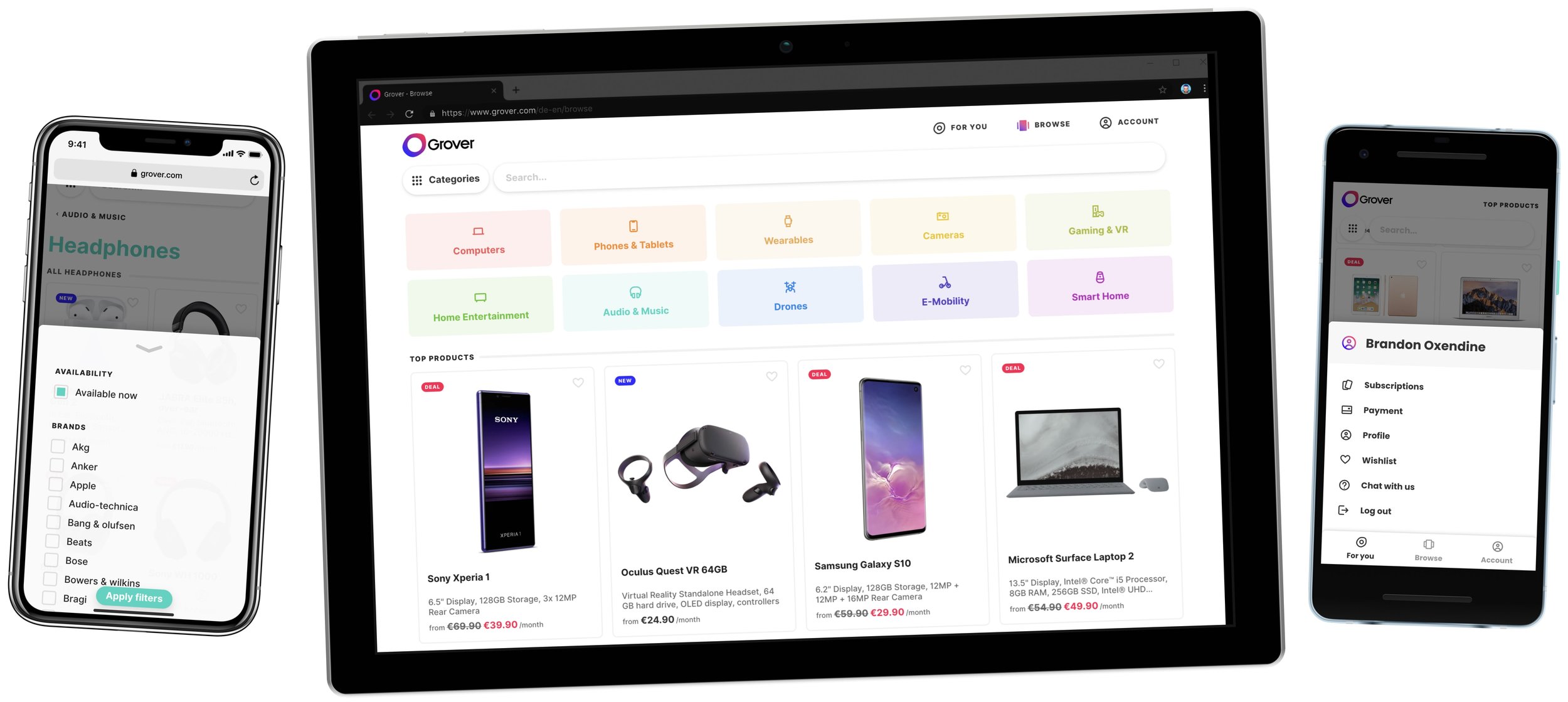
Grover was a young Berlin startup when I started, renting cameras, phones, laptops and scooters. My job had two halves. One was building a team: hiring designers and researchers, running weekly one-on-ones and critiques, and working closely with product and engineering. The other was giving the product a consistent visual language that the team could build with.
I wrote some of what I learned about the first half in The first year leading design at a startup, How to onboard designers and On managing designers. This page is about the second half.
Jump to: Category system, Icons, Foundations, Illustration, Product discovery, Product page
A system for categories
A rental catalog is wide and shallow: thousands of products in a handful of families that people browse by. So categories became the backbone of the visual system. Each of the ten top-level categories got its own color, an icon for itself and one for each subcategory, and those followed the category everywhere: the menu, the category page title, the filter controls, the product tiles.
The menu was where it came together. It’s a two-layer dropdown where each row lights up in its category’s color. In the implementation we also drew an invisible triangle from the cursor to the subcategory list, so you can move diagonally to the second layer without accidentally switching categories on the way. Nobody notices it, which is the point.
 Wearables
 Cameras
 Home Entertainment
 Audio & Music
 E-Mobility
 Laptops
 Smartphones
 Smartwatches
 Gaming Consoles
 Drones for pros
 Smart Speakers
Icons
I drew 44 icons, one for every category and subcategory, on a 24px grid with heavy lineweight, used in the menu, on category pages and across the product. Each top-level family carried its category color.


Foundations
Underneath the category system sat a small set of foundations: Grover’s pink, a near-black text color, a single hairline color for borders, two shadows and a short list of corner radii.
#FE1251#333333#F1F1F10 4px 10px · 0 0 3px0 7px 15px · 0 0 3px8px24px“The catalogue is much more visible. It looks tidy and modern.”
From a Grover customer survey sent out after the launch.
Illustration
I worked with Penny to define a fun, friendly new illustration style. We wanted to do something that made the service feel easy to use and lighthearted.
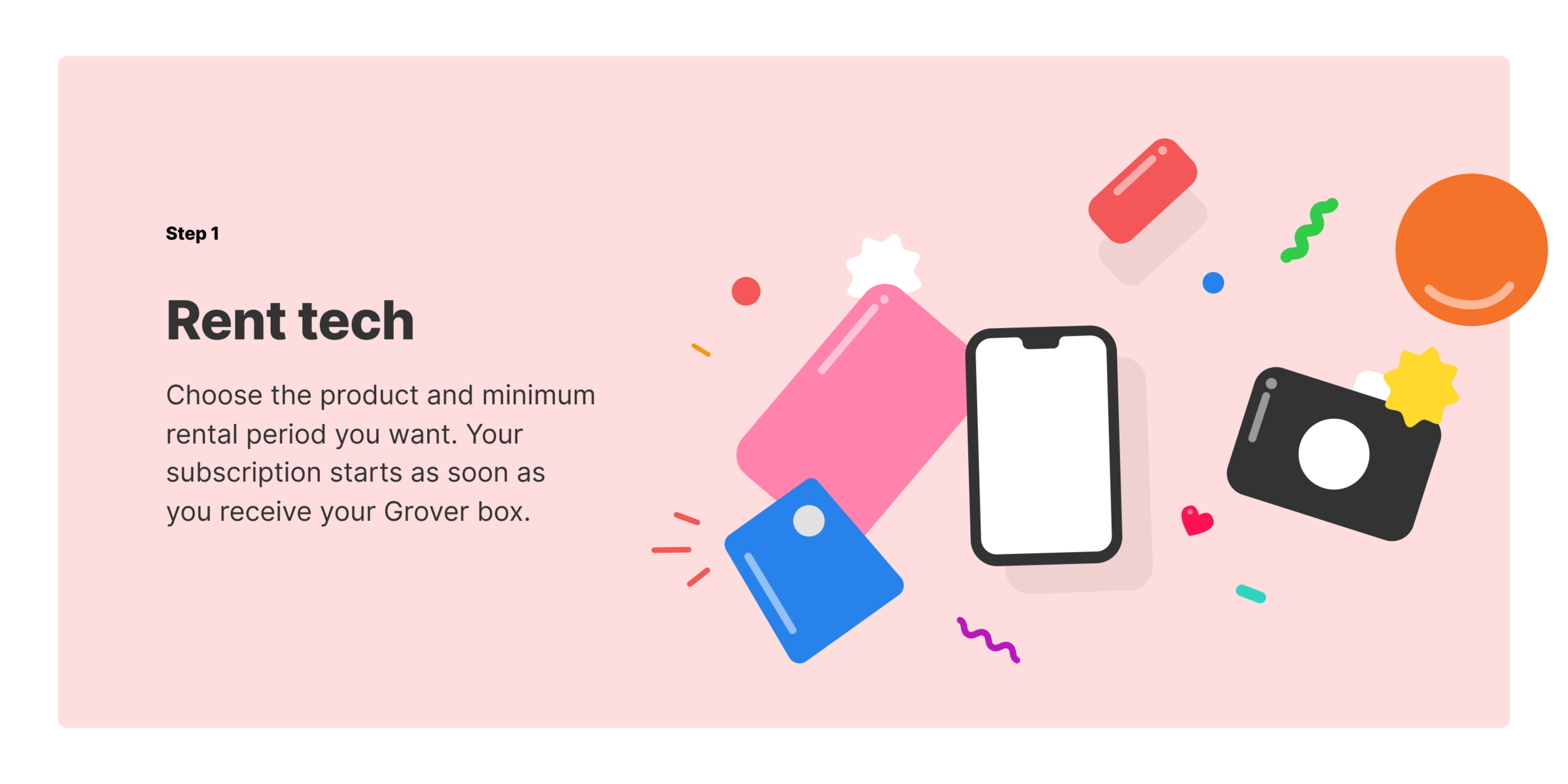
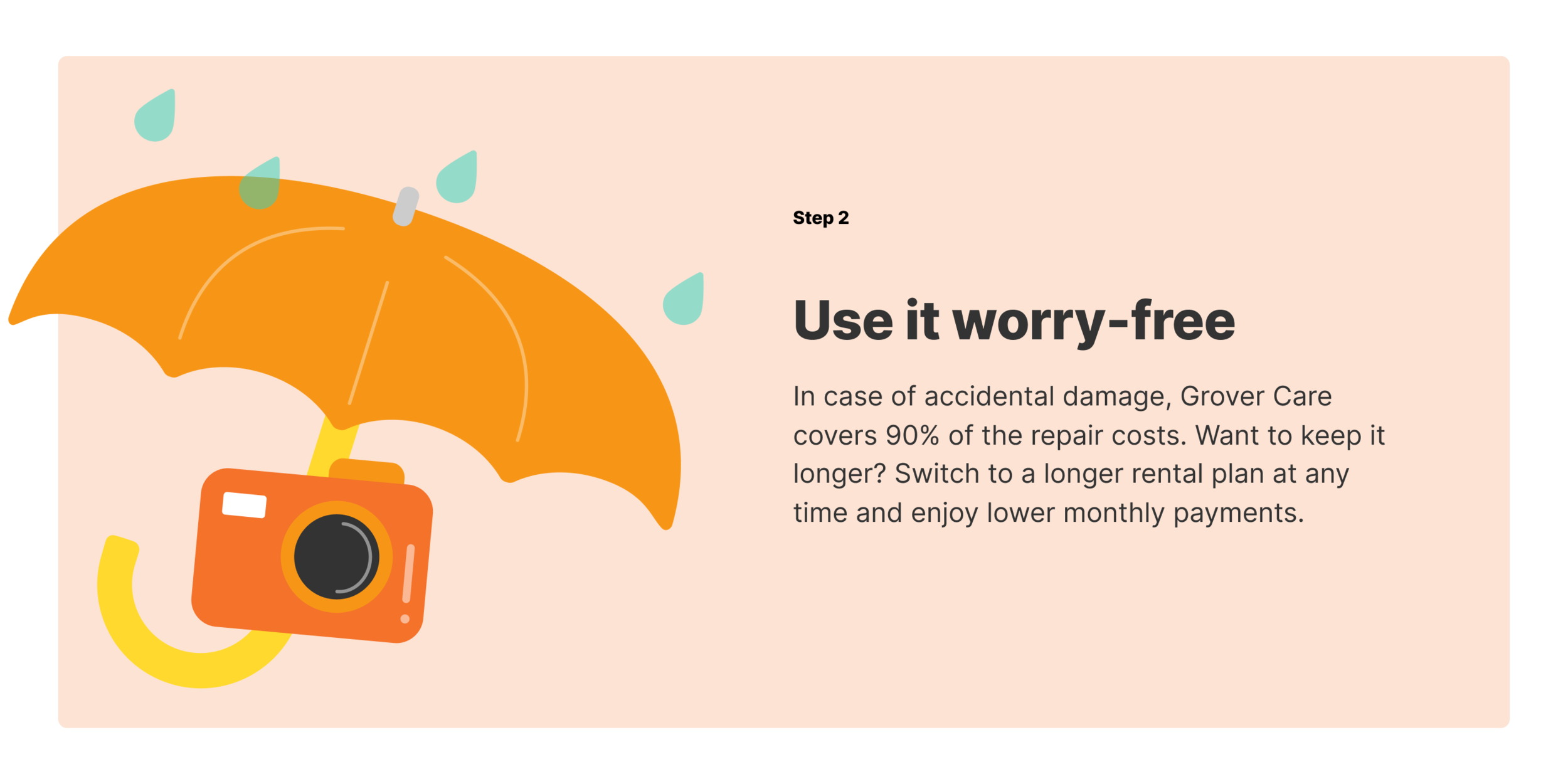
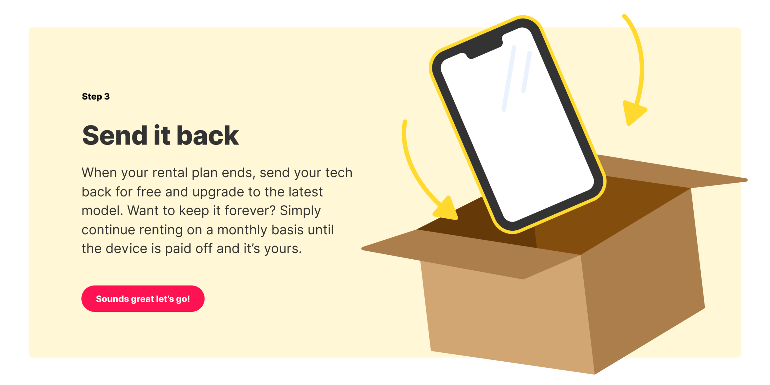
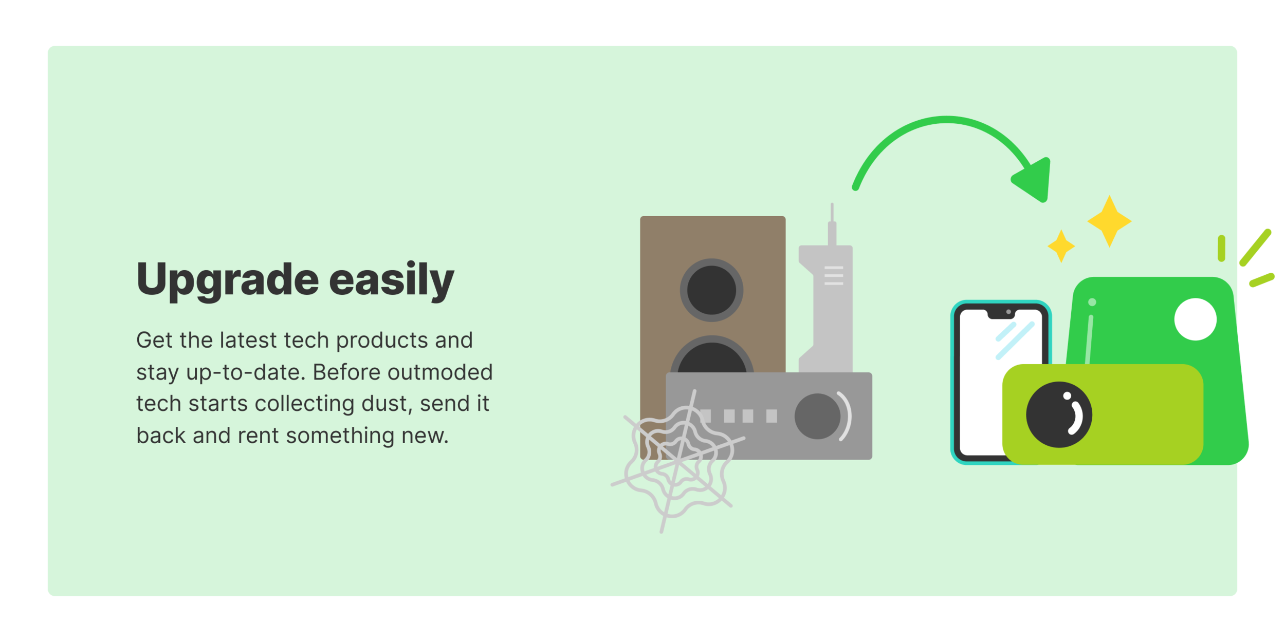
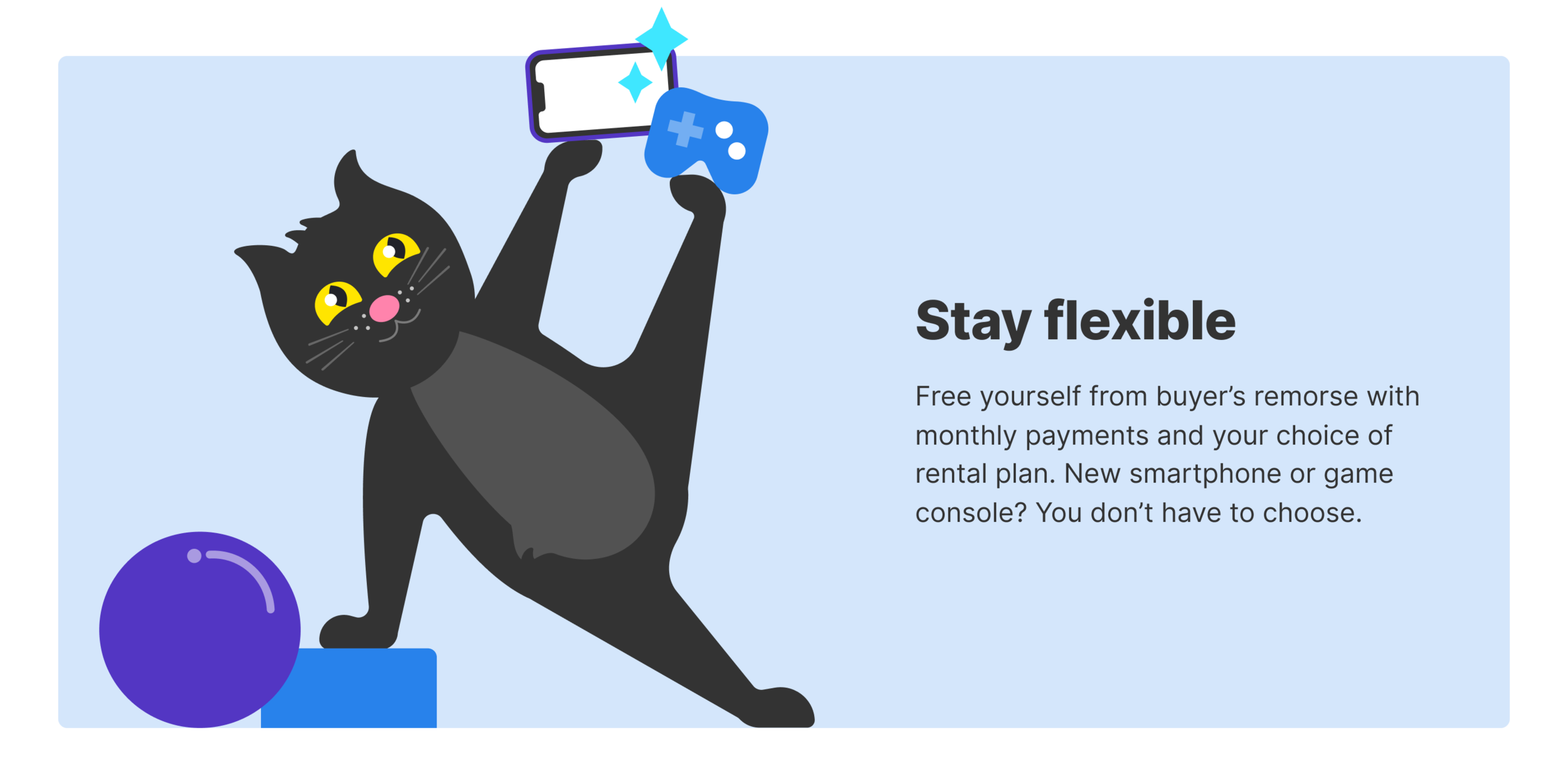
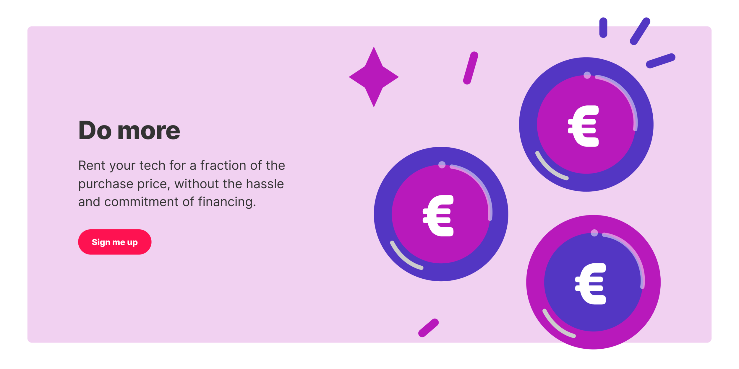
Spots illustrating the benefits of renting with Grover.





Illustrations guiding the sign up experience.
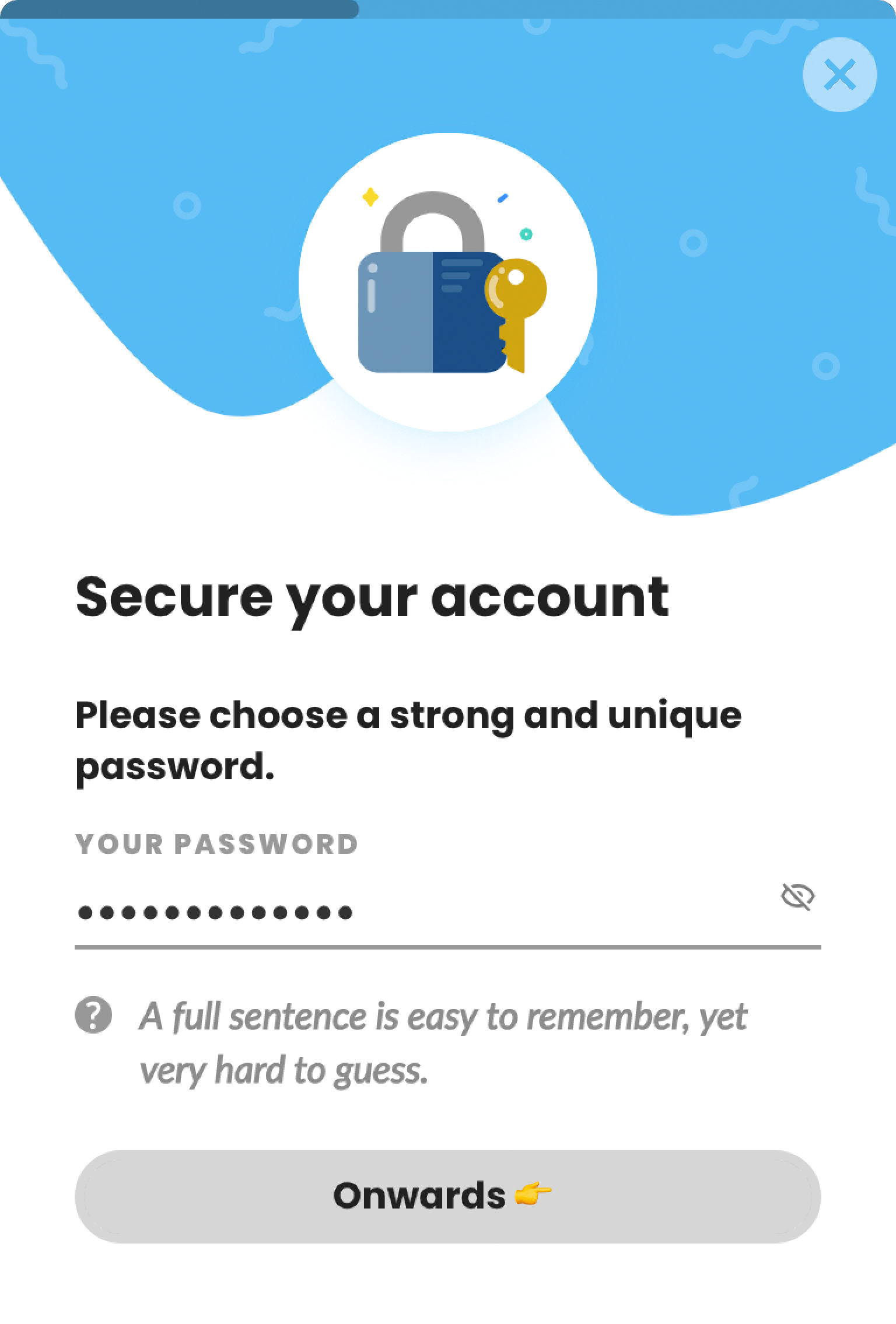
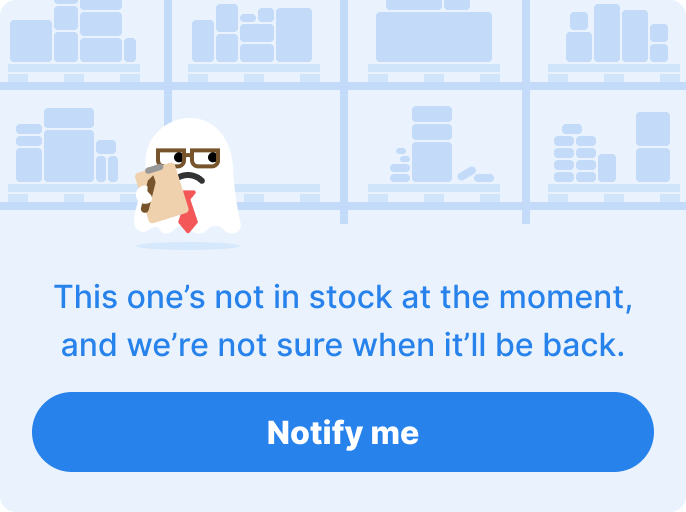
In a poll of our users, 74% said the new design was a positive change.
Product discovery
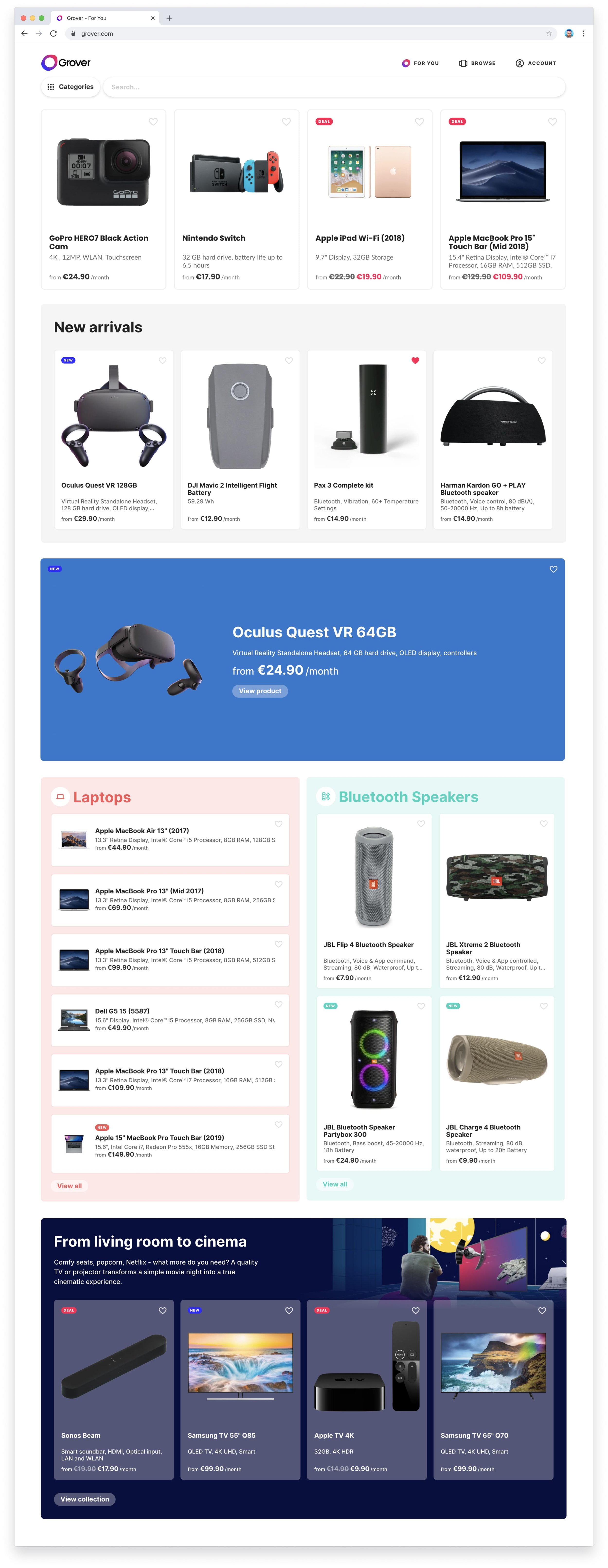
To give users a new way to discover products and keep the experience fresh and automatically updated, we built a product feed that shows something new each time the page is visited. Rules like “Show the top product from the top 4 categories in the first row” satisfy business needs while also showing users the hottest products right now. Rules like “Show the top products in a random category” enable discovery of new products that users might not know we have. “Display a random collection” lets users dive deeper into our curated content.
Product page
A lot of ad traffic is sent directly to the product detail pages, so on these pages we had the unique challenge of showing all the product details in addition to explaining how Grover works. The result is a long page with tons of information on it, structured in a way that answers new users’ questions about Grover.
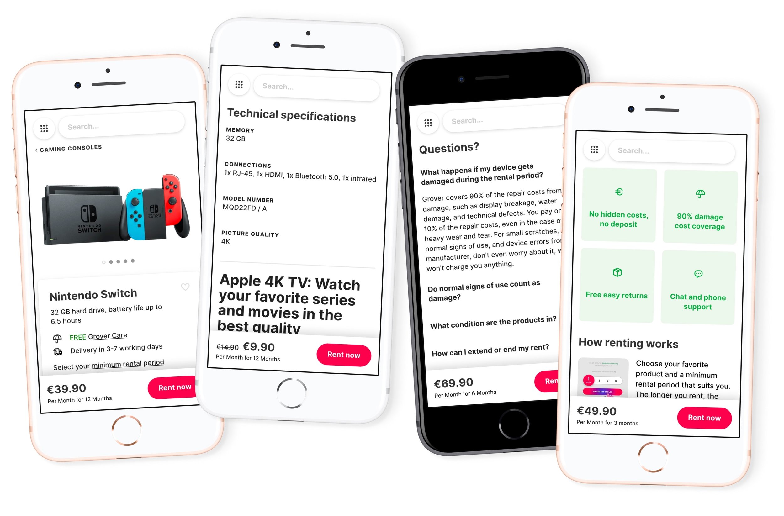
“The design is more modern. You know directly that it’s the market leader.”
From a Grover customer survey sent out after the launch.