Migaku
A new visual language for an immersion language learning app, and the design system that carried it across a browser extension, a flash card app and a website.
Role: Visual Design, Branding, Icons, Design System
Illustrations: Enisaurus · Live at migaku.com
Migaku teaches languages through the things you already watch and read. A browser extension reads the page or the subtitles you’re looking at, shows you which words you know, and lets you turn any sentence into a flash card. A separate app is where you study those cards. The people who use it are serious: they want to be fluent, not to collect streaks.
I worked with Migaku as a freelance visual designer. When I started, it looked like most software of its kind: a blue globe logo, stock illustrations, blue buttons, Material icons. My job was to give it a personality worth remembering and then make that personality usable. I redrew the wordmark, built the color, type and component system in Figma, drew the icon set, and worked with the illustrator Enisaurus on a cast of characters. Migaku’s engineers built the system into the extension and the apps.
Jump to: Brand, Color, Type, Components, Reading colors, Icons, Extension, Flash card app, Website
Brand
Migaku’s audience started with Japanese learners, people who grew up on anime, manga and games and are happy to have a little fun. So the brand leans in: a rounded, heavy wordmark with the Tomoe swirl from the old logo tucked into the M, an orange-to-pink gradient that runs top to bottom everywhere it appears, and a deep navy ink instead of black.

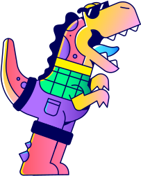
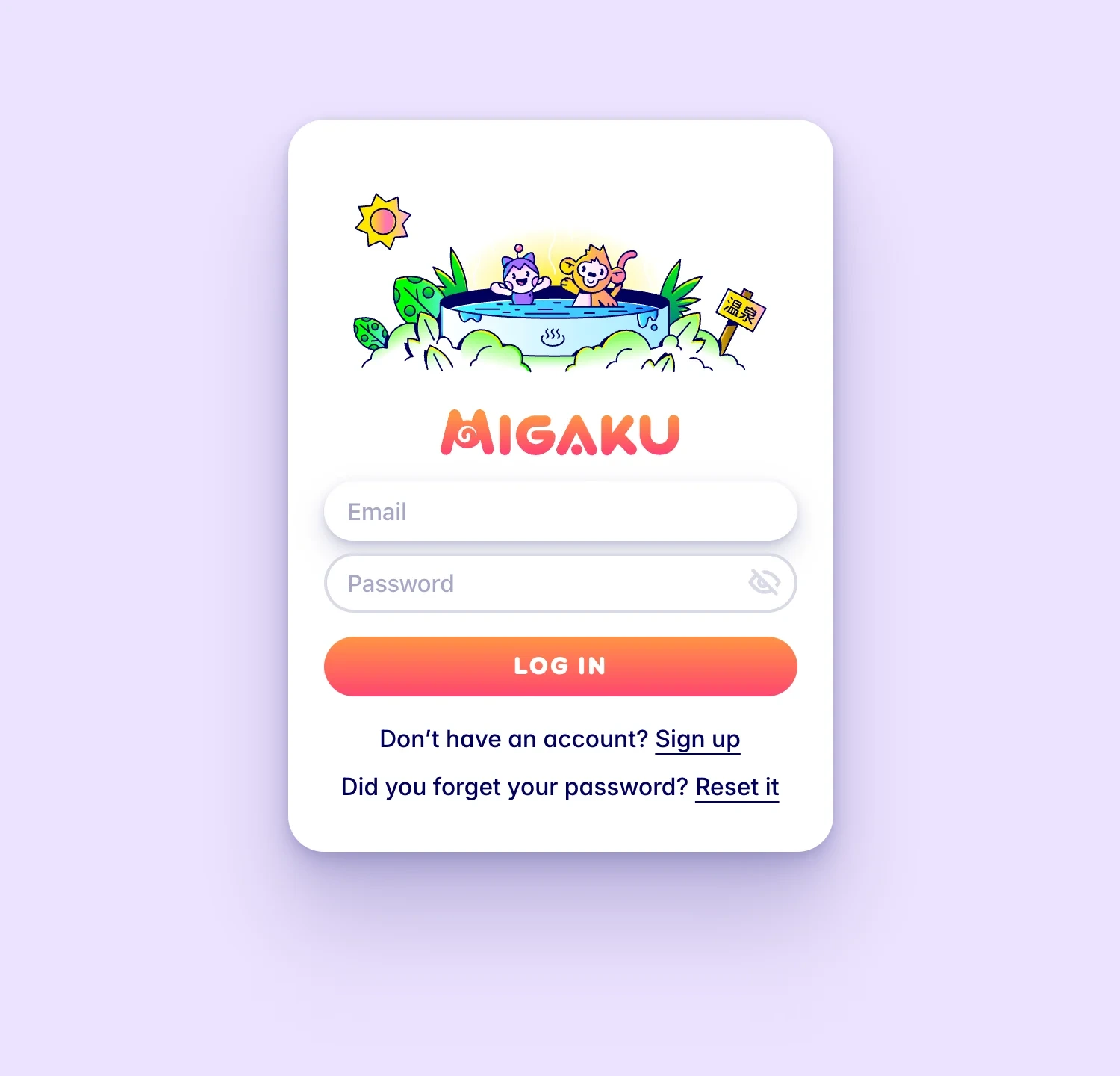
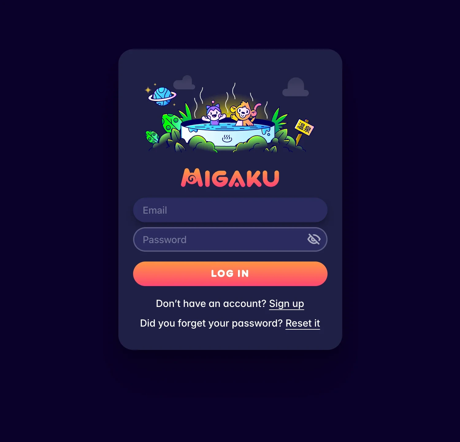
I worked with Enisaurus on the characters: Migachu, the cat-eared mascot, plus a monkey, a very cool dinosaur and a crowd of others. In the product they turn up in the moments that need a little warmth, like logging in, an empty deck, an error or finishing for the day.











Color
The system is built on three things: the brand gradient, an ink color, and six accents. Everything gray is the ink at a lower opacity rather than a separate hex, so grays always lean slightly blue and sit comfortably next to the navy text.
#ff9345 → #fe4670
#00005a
80%60%35%15%7%Each accent comes in three steps. The base color is for text and icons; a low-contrast tint is for backgrounds; a high-contrast shade is for borders and text on tinted surfaces. A button, a status label or a callout picks an accent and gets all three. In dark mode the same names point to different values, and success, error, warning and info map onto accents 5, 2, 3 and 1.
Elevation works differently per theme. In light mode every surface is white and depth comes from shadow alone, and the shadows are tinted with the ink rather than black, which keeps them from going muddy on the lavender backgrounds. In dark mode the surfaces themselves step lighter and the shadows go neutral.
Type
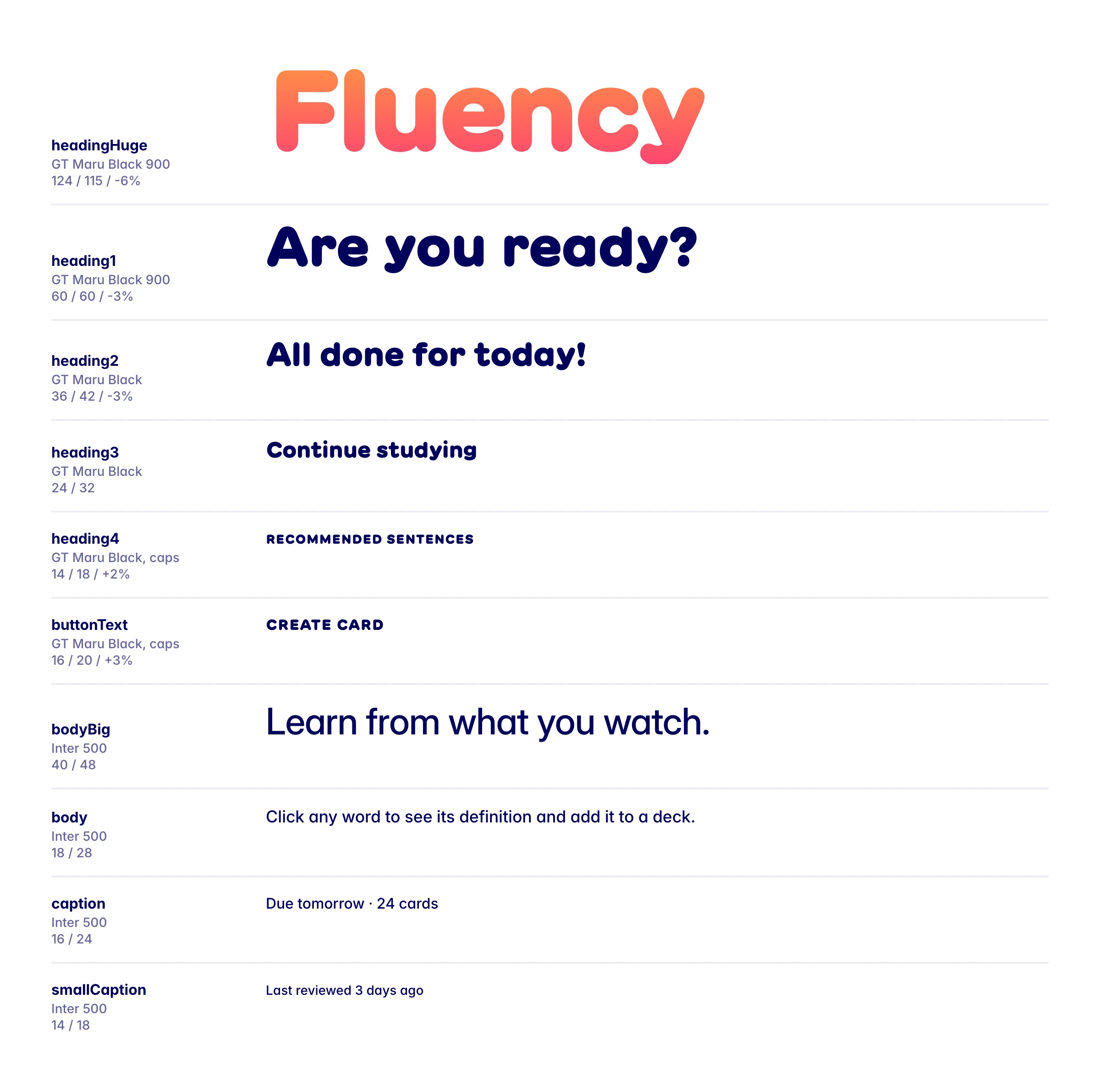
Two families. GT Maru does all the shouting: headings, buttons, the little uppercase labels. Inter does everything you actually read. There are ten named styles, each with a mobile and a desktop size, and that’s the whole scale.
Components
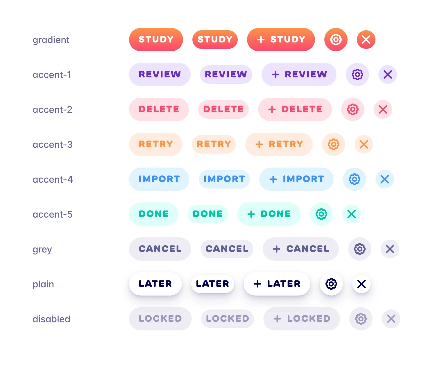
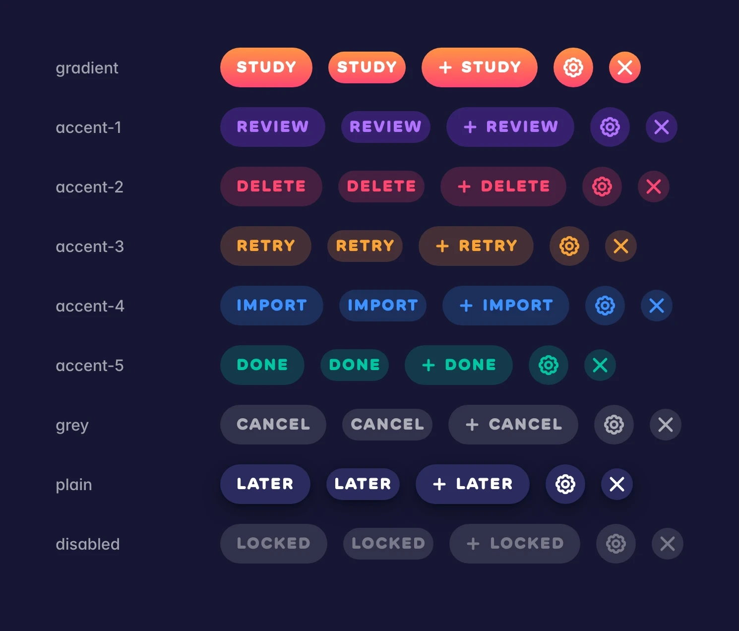
The components are deliberately few and very consistent. Buttons are pills with GT Maru labels, and every accent works on every button. Anything you can press grows a little on hover and shrinks a little when pressed, which makes the whole product feel squishy in a way that matches the characters. All of that motion drops to nothing when the operating system asks for reduced motion.
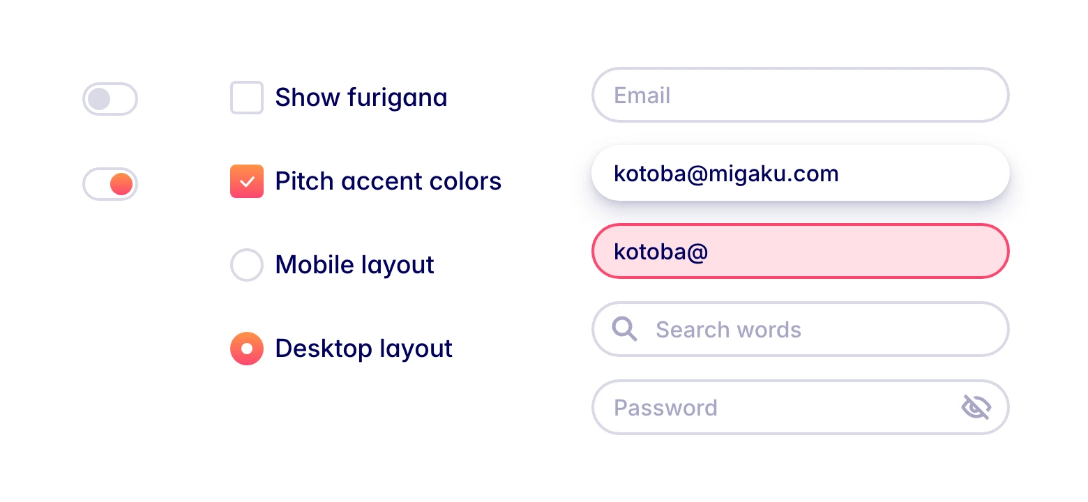
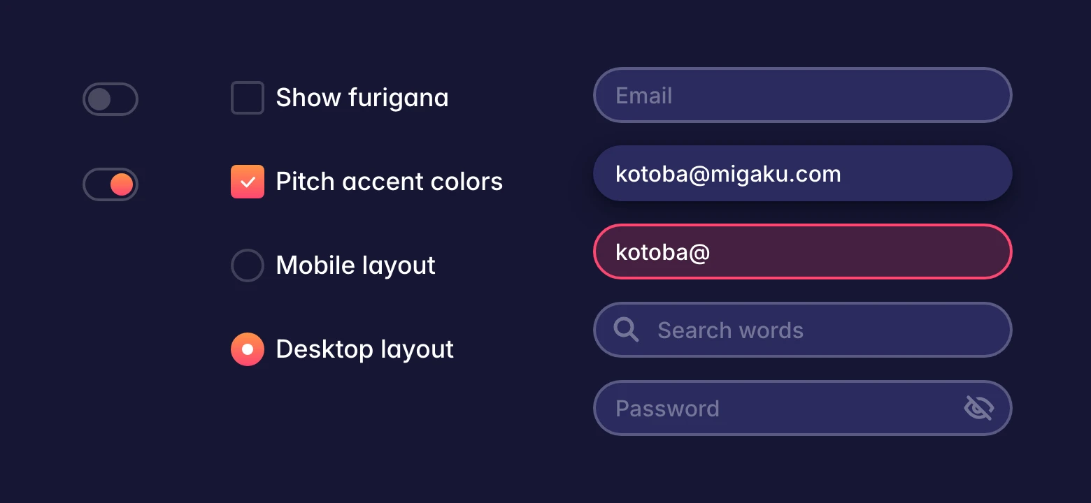
Form controls share the gradient: a checked checkbox, a selected radio and the knob of a switched-on toggle all fill with it, so “on” always looks like the brand. Inputs are fully rounded, and instead of a focus ring color they lift off the page with the elevation-2 shadow.
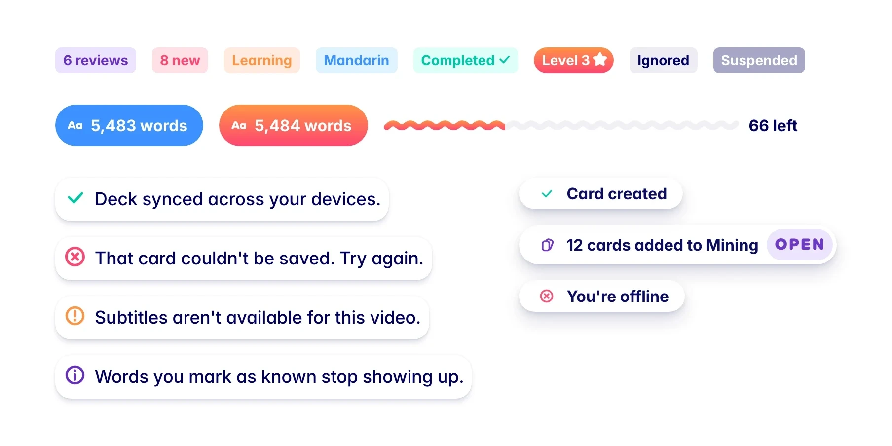
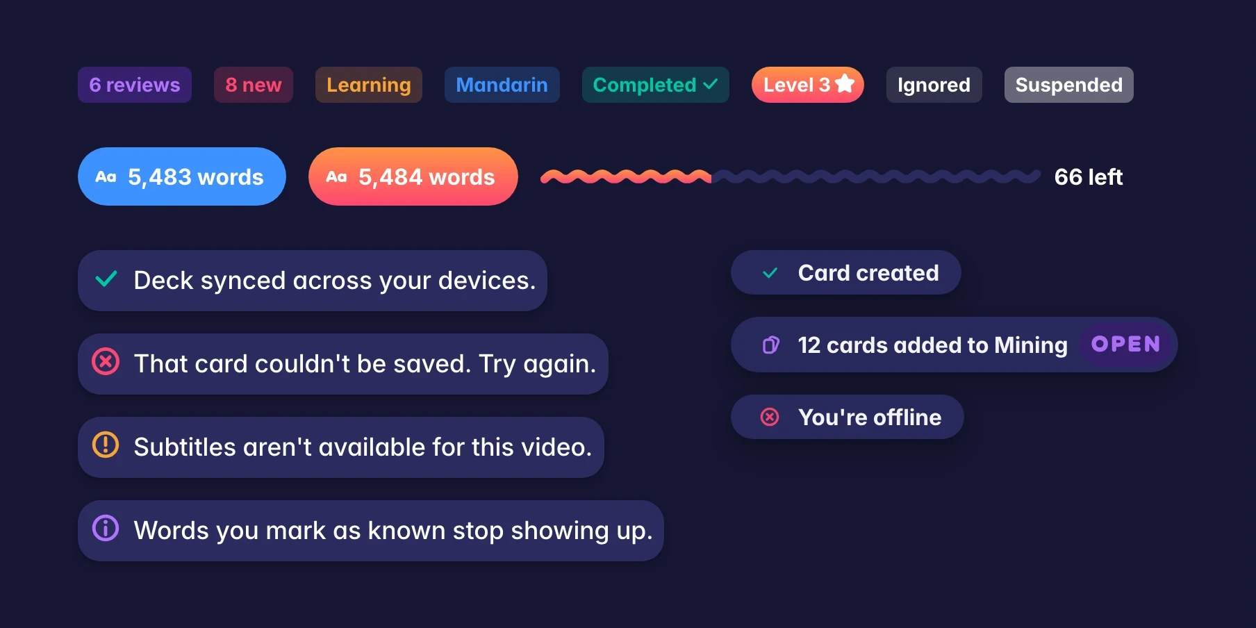
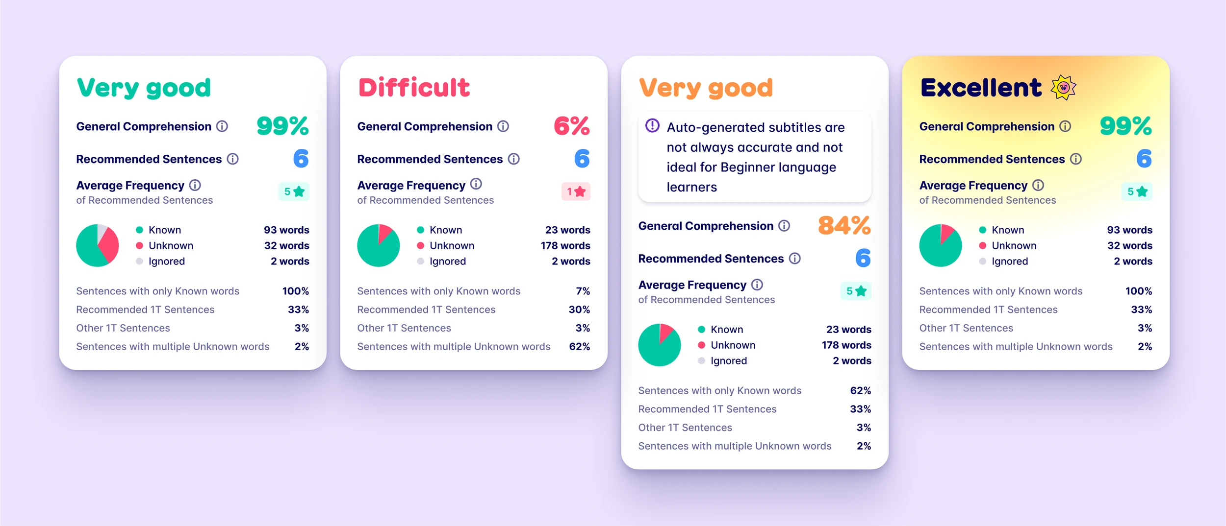
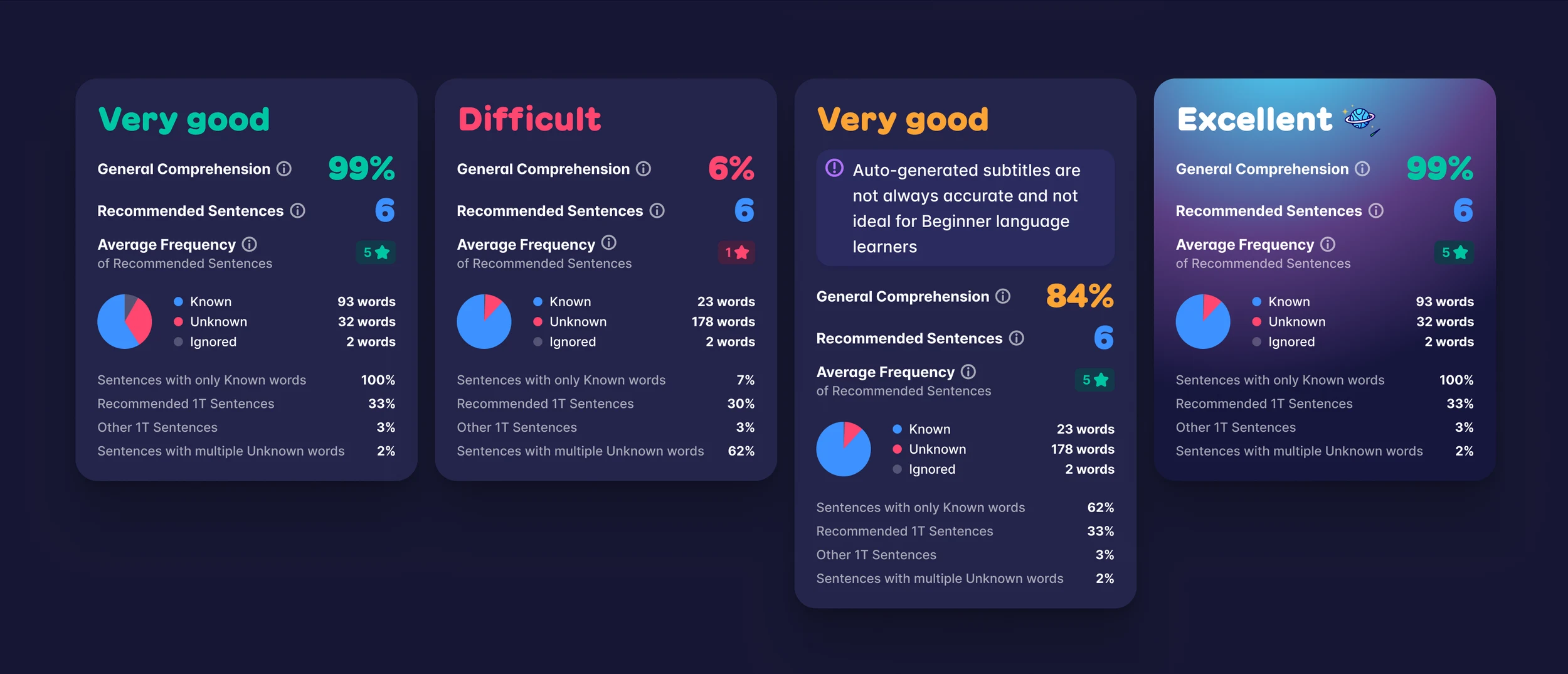
Then the small stuff that does most of the talking: status labels in any accent, the blue known-words counter that sits in the toolbar, callouts, toasts, and a progress bar that’s a squiggle instead of a line.
One constraint shaped a lot of this. The extension draws its UI on top of other people’s websites (YouTube, Netflix, news sites), so the system can’t trust the page around it.
Reading colors
Migaku’s most important UI isn’t a component at all. It’s the text of whatever page you’re on, which the extension underlines word by word to show what you know. That needed its own small system: one color per word status, quiet at rest and full strength on hover, plus colors for pitch accent in Japanese and tones in Chinese. They borrow from the same accents, so a word you’re learning is the same orange as the “Learning” label on its card.
毎日少しずつ日本の映画を字幕なしで見ています。
- Unknown
- Learning
- Unknown, tracked
- Known (no underline until hover)
- Ignored
Icons
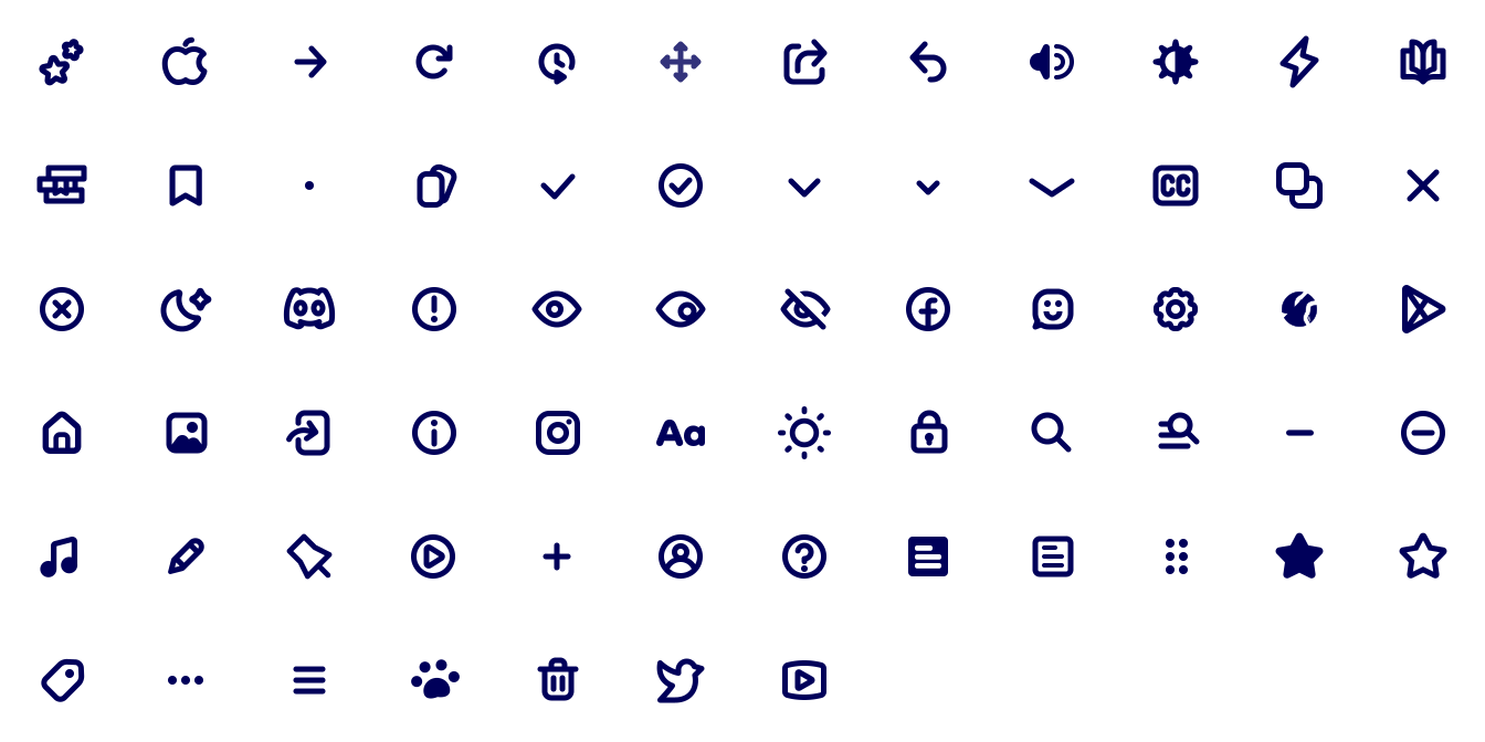
I drew a 67-icon set: filled, rounded shapes on a 24px grid. It covers the product (cards, decks, sentences, tracking, subtitles), the platforms (YouTube, Anki, Apple, Google Play) and the usual interface verbs.
The extension
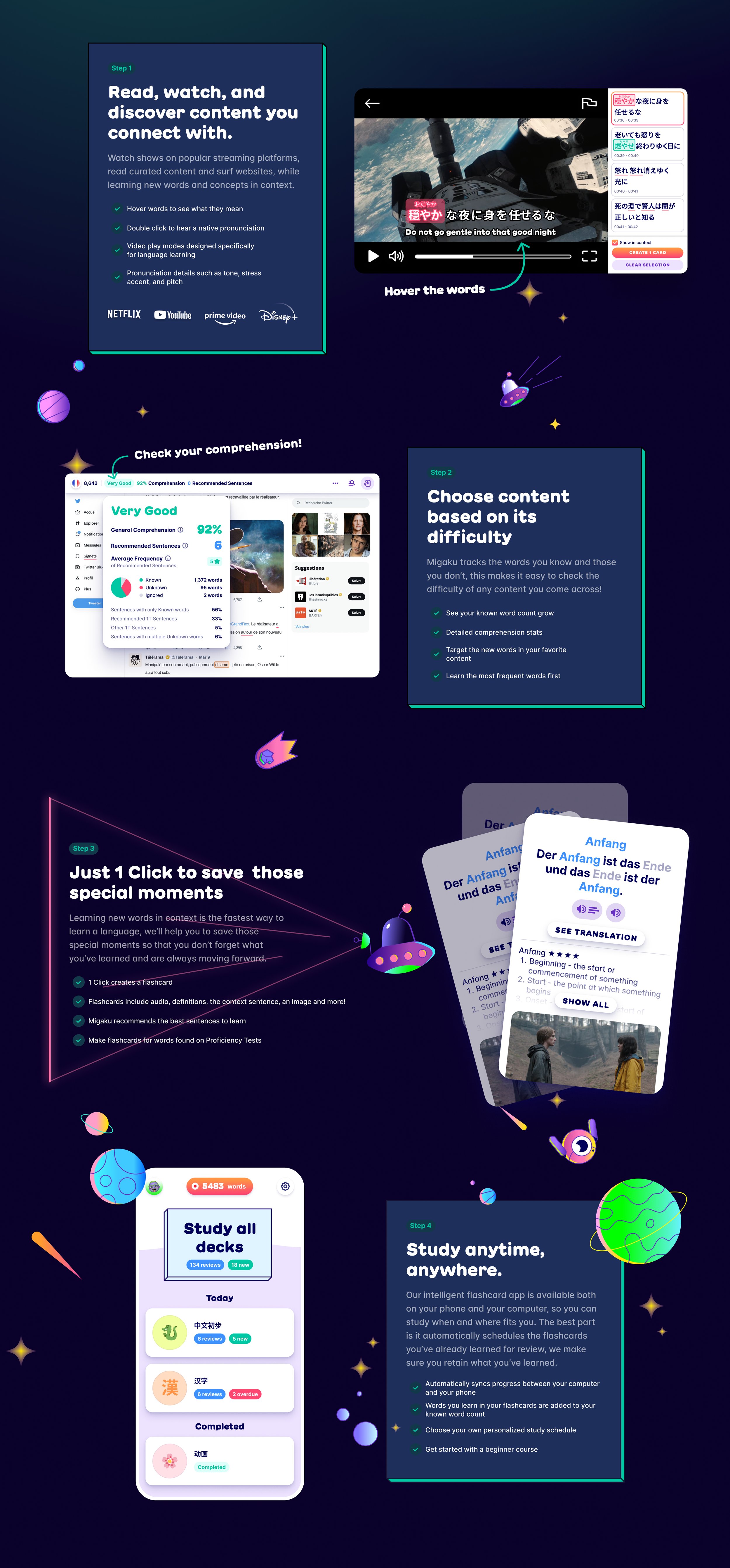
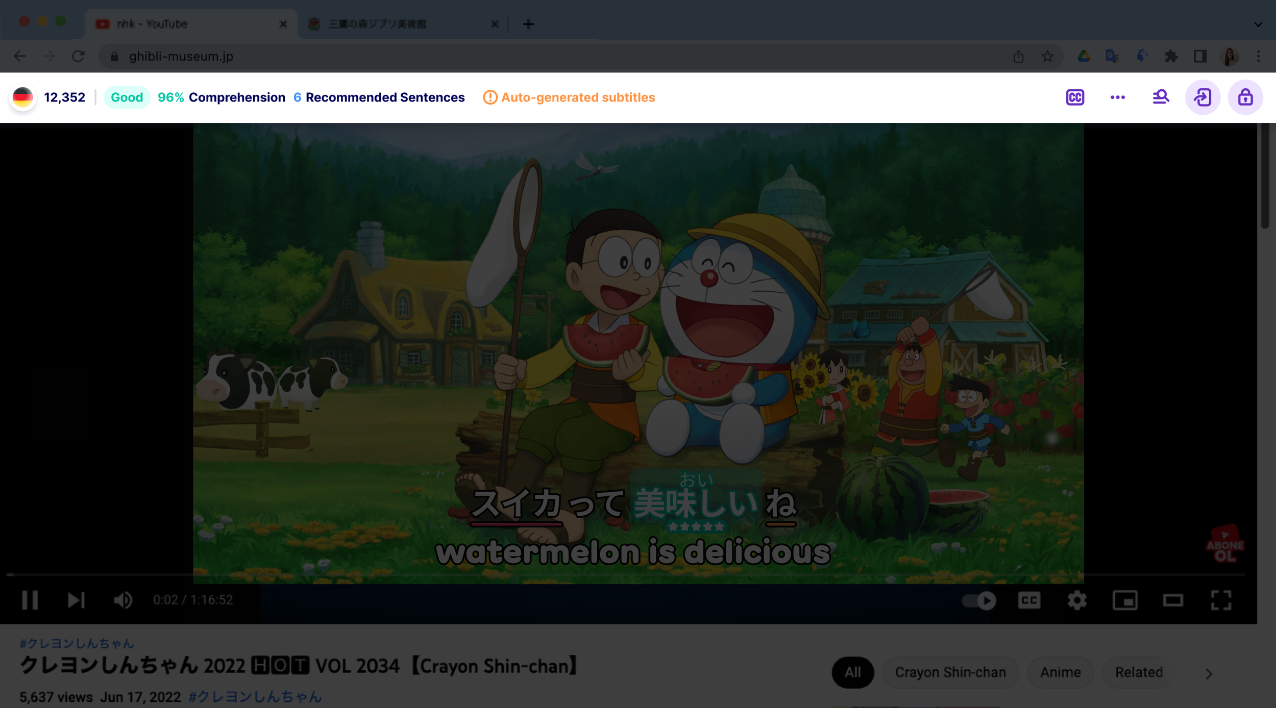
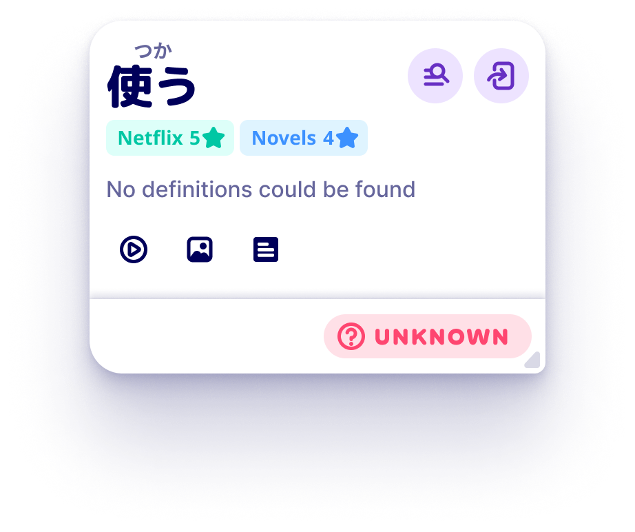
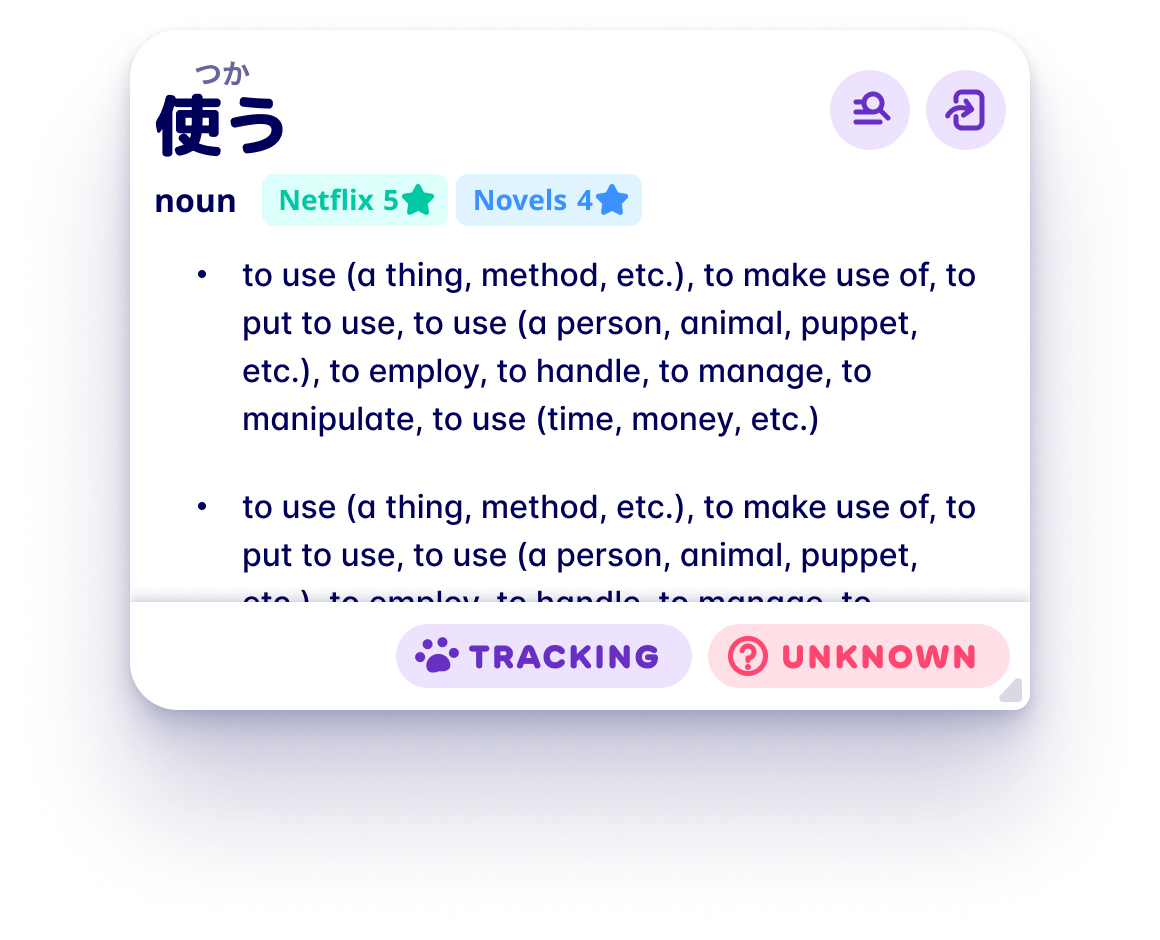
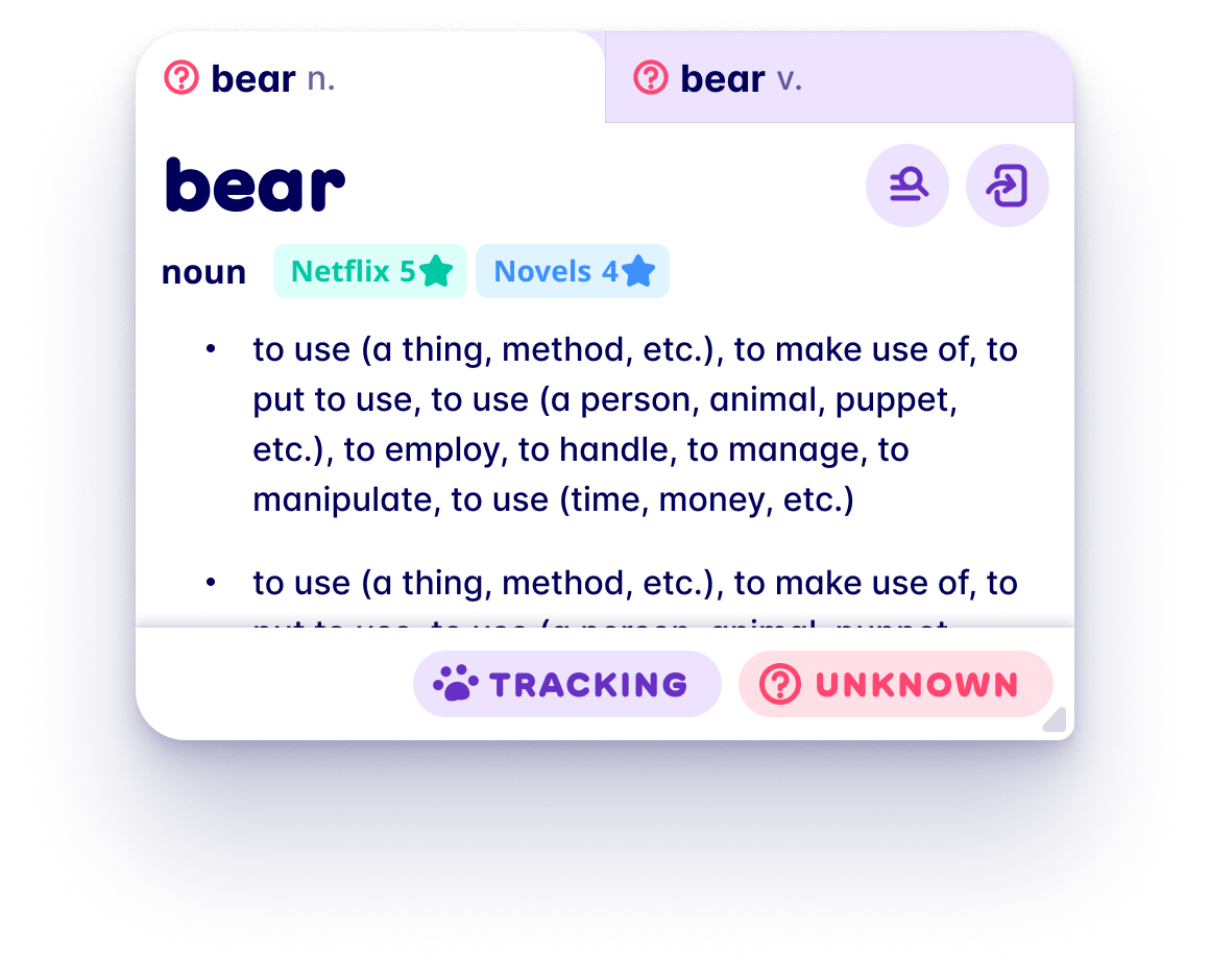
The browser extension is the heart of Migaku. Without it there’s nothing in your flash cards. It parses text on any site and subtitles on the big streaming platforms, adds a toolbar with your known-words count and the page’s comprehension score, and opens a popup dictionary when you click a word, where you can build a card from the sentence you just saw.
Flash card app
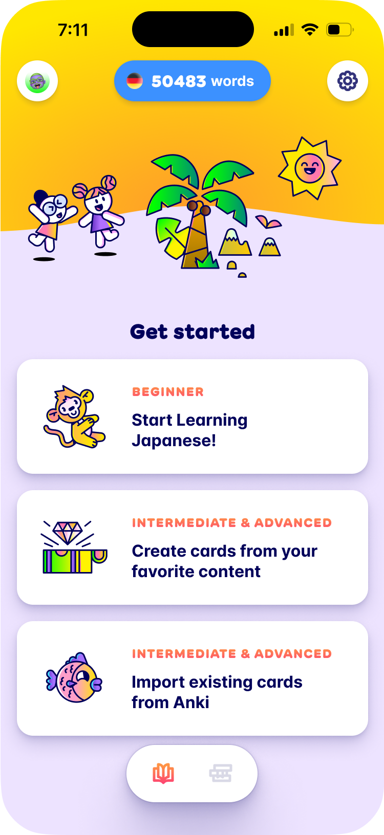
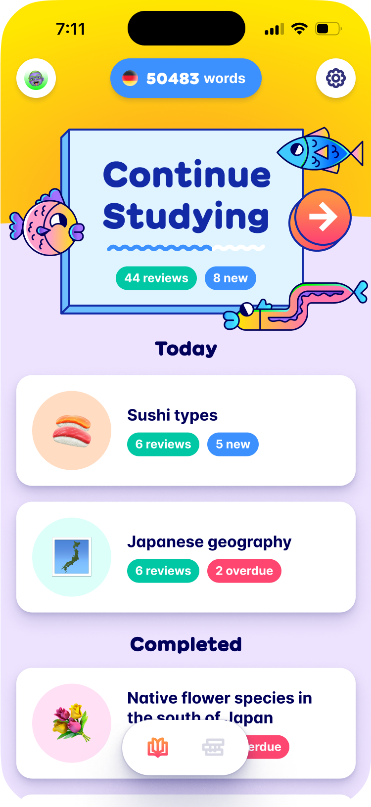
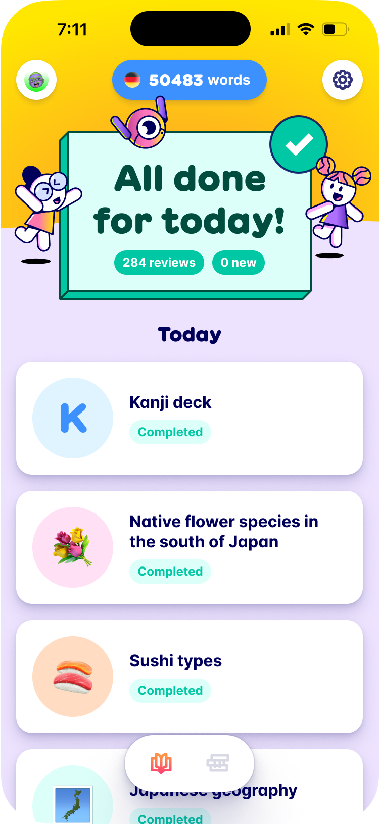
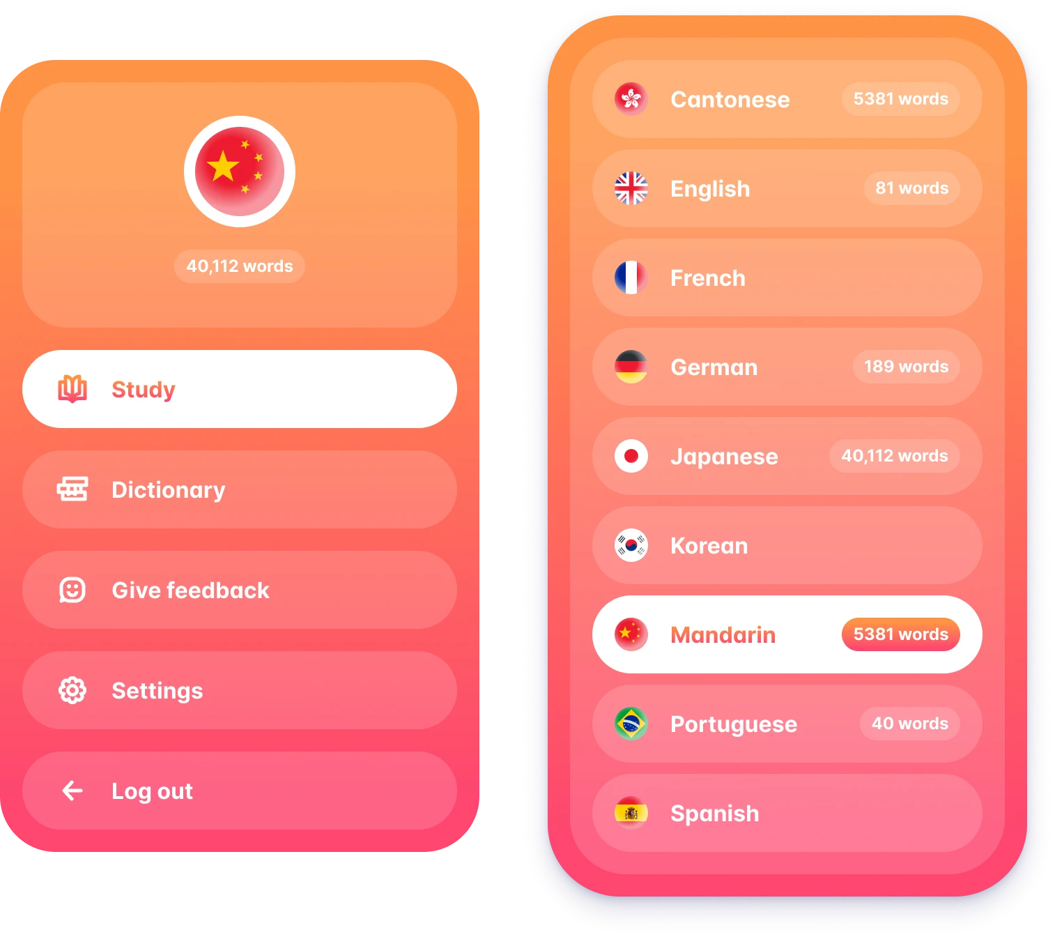
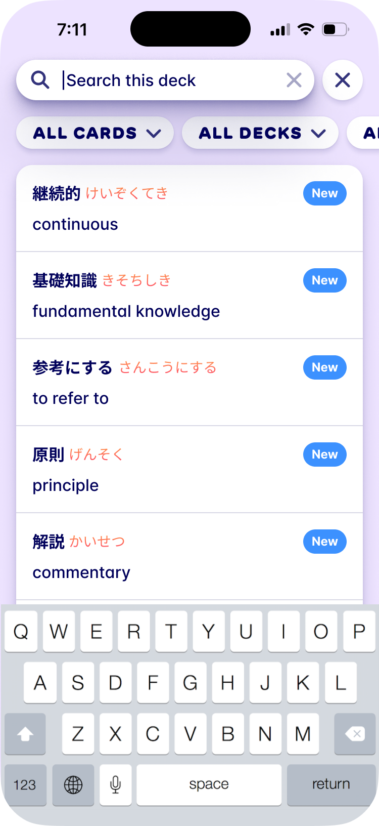
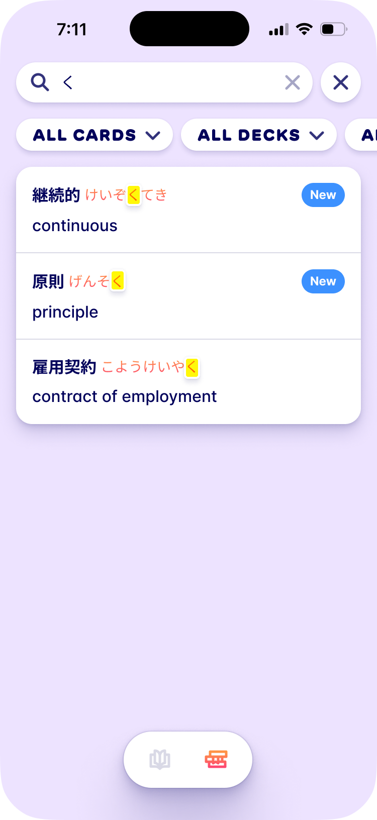
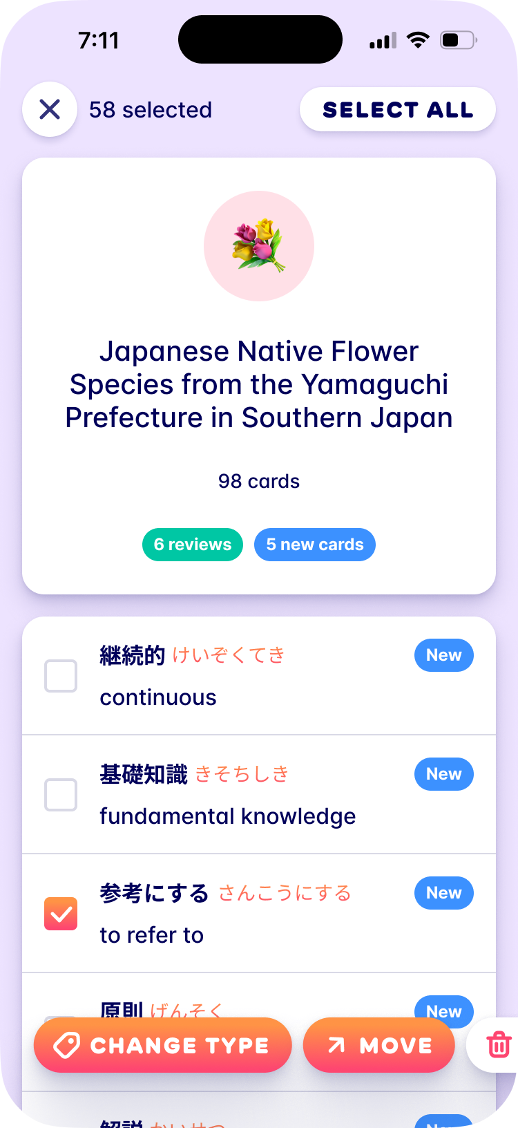
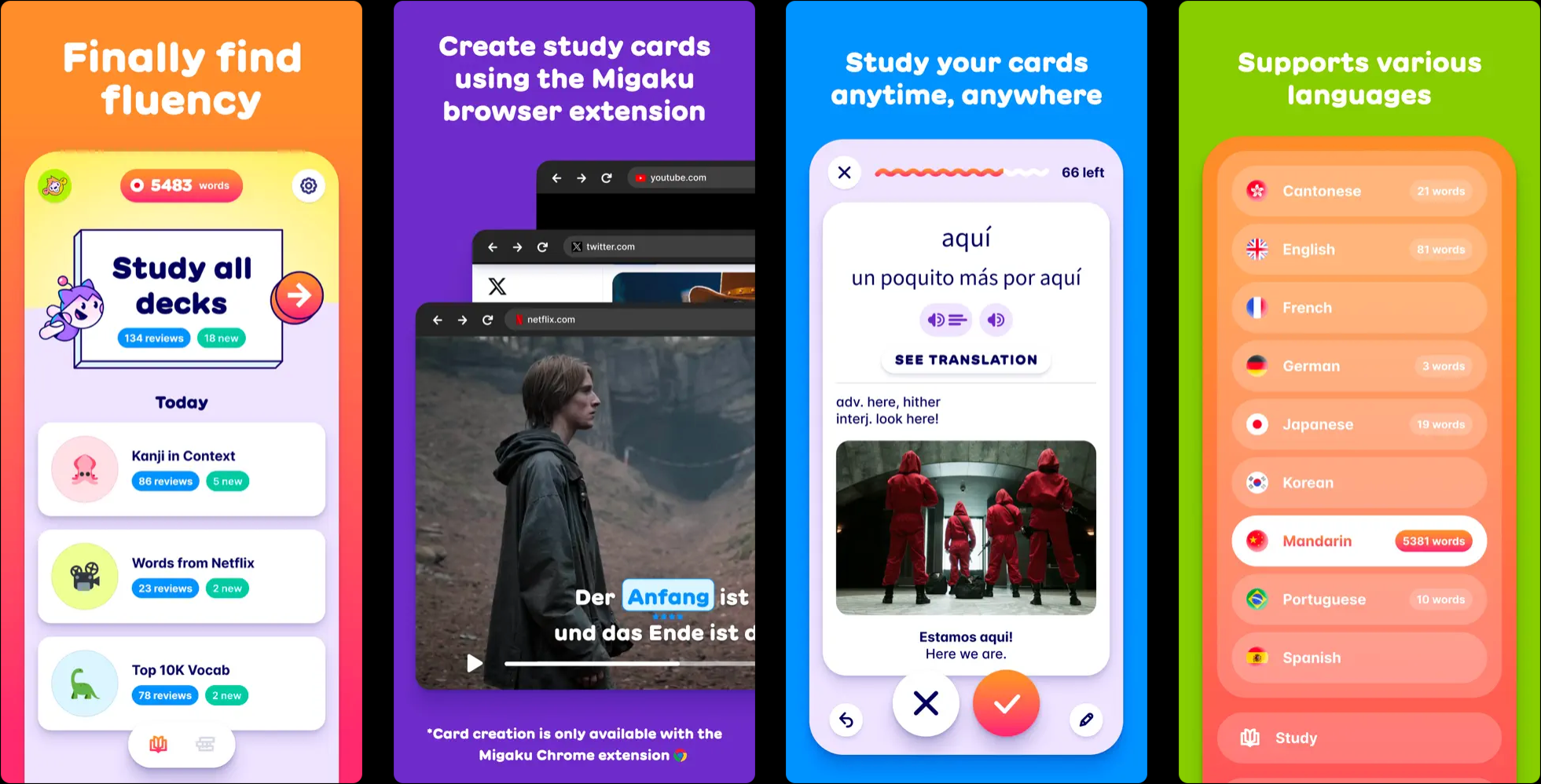
The study app had the opposite problem from the brand. It had to be fun without being goofy, because the people using it are trying very hard to get fluent and don’t want to be patronized. So the characters and the gradient show up around the edges, at the start and the end of a session, and the studying itself is calm and fast.
Website
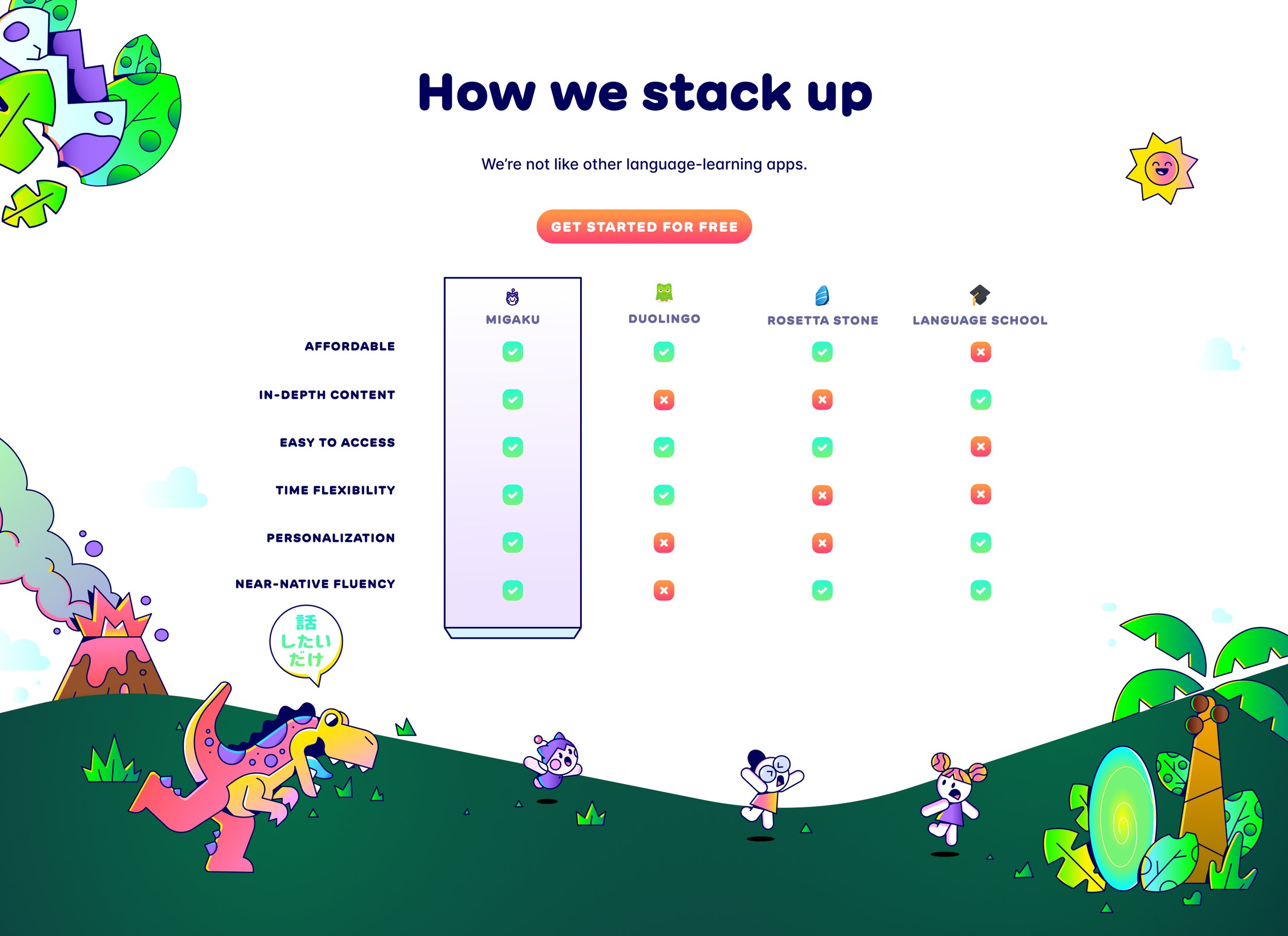
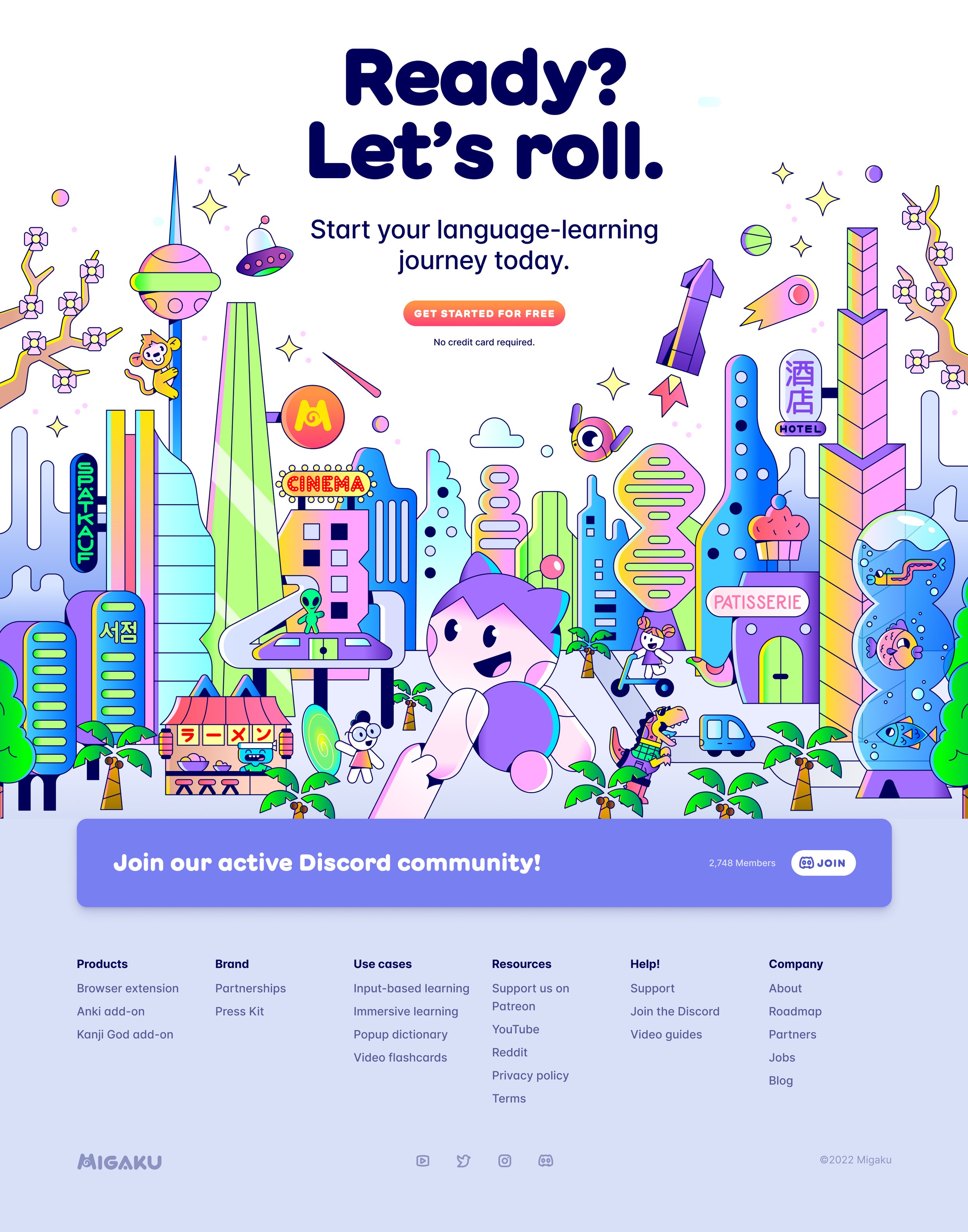
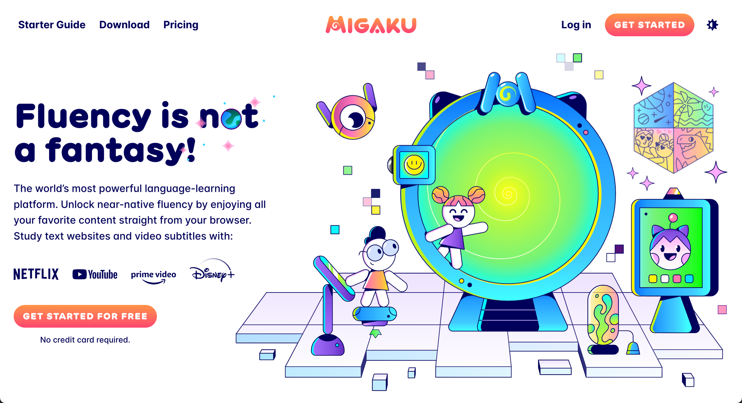
Migaku is a family of products, and the website had to explain all of them without turning into a feature list. Since the whole idea is immersion, the page takes you through a series of worlds connected by portals, with the characters guiding you along, and ends at a party in a futuristic city where everyone you met shows up again.