Radicle
A way to collaborate on code built on a p2p protocol instead of hosted on centralized servers. In the decentralized crypto future, everyone will use Radicle.
Role: Brand, UI, UX, HTML, CSSThe screenshot of the app with a sticker covering the camera was appreciated by the privacy-focused user base.
Jump to: Brand, Website, App, Design System, Token Launch, Rad Radio
The Brand
We started with an easygoing idea session with the whole team where everyone designed some Radicle-inspired posters. This helped us get a sense of what the brand was from those working on it (not just me!). It was a really great team building exercise and also helped me get an idea of where to start with the brand. (Thanks Ele for the idea).
CONCEPT 1The first concept was supposed to be a natural extension of the the style of the app. It was loosely based on the app’s icon set I drew. This direction reminds me of a vintage tech brand (think Apple, NeXT, and IBM in the 90s) which seemed to vibe with Radicle, but in the end felt a bit too normy and polished. I spent way too much time drawing these illustrations.
CONCEPT 2The second was supposed to be sort of zine-themed. Balancing a zine aesthetic with nice serif typography was cool, but ultimately it felt a bit forced and the random p2p graphics didn't really feel relevant. TBH I was totally trying to rip off the Boot Boyz aesthetic anyway. 👏 NEXT ⬇️
CONCEPT 3The third one really went hard on the “coding with friends" idea. I even developed a character (Penty the Friendly P2P Pentagram 😅😂) but honestly this direction felt way too childish … kind of like a code school for kids or something. I still think about Penty sometimes. 🥲
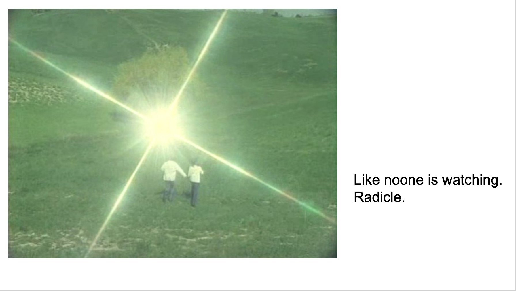
CONCEPT 4The last one was just bonkers. I am honestly crazy4this1. But uhh hear me out: what if Radicle was a cult. I might have watched too many documentaries on cults, idk. Conceptually the idea is pretty awful. (Cults are bad.) But there was something there. Think cult status.
And we ended up going with it. This direction felt the most honest and raw. The aesthetic was cool but the cult imagery was awful and needed to change so we swapped cults for Internet art and WE GOT A BRAND©®™.
I made some t-shirts too!
The Website
While doing branding is honestly all just fun and games, we had a complicated p2p code collaboration ecosystem to explain. 👎 Boring right? No! The site then extended to explain the full ecosystem of the tech behind Radicle.
🖋 VIEW FIGMA FILEWe tried to avoid jargon as much as possible while still explaining the product in a super clear way. Abbey, Alexis, Ele, and Ange really nailed the copy. Paired with screenshots from the UI, it was a big hit. People mostly got it. Or they got distracted by the GIFs.
The two main calls to action besides signing up for the mailing list are to get involved with the community, and download the beta.
Roadmaps are hard. We tried to keep ours vague enough to not disappoint people, but with specific enough general features to help people understand our plan. So far, it’s been accurate.
The App
Building a peer-to-peer app is complicated. If you’re not familiar with the way p2p networks work, just know that in the vast majority of apps you use, there’s a server where everything comes from. In p2p apps, things are shared among people who happen to be online. That means information is not always the same among users. That makes for very complicated user experience problems.
🖋 VIEW FIGMA FILEApp icon among other Apple apps.
PROFILEThe profile shows the projects that you’ve created and the ones you’re following. Following a project begins tracking that peer, which means you replicate their projects to your network.
Viewing another user’s profile.
AVATARSSince there’s no server and no way to host images, there aren’t traditional avatars in the app. We generate a unique emoji and color based on your Radice ID and display name. I think that’s pretty fun. In the future we’ll use the Ethereum Name Service to get avatars.
Collection of avatar and color combinations.
PROJECTSThe project page, where the repository lives, is very similar to a basic GitHub repository page. One challenge with this page was balancing things that are universal to the project, and things that are specific to the peer you have selected in the top right. We blur this difference a bit just to keep this complexity relatively easy on the user. For example Files and Commits are dependent on the peer you have selected, whereas Patches and Issues are universal.
The project page displays the README.md file by default.
ISSUESThe bug- and idea-tracking part of a project uses a complicated peer to peer replication solution called collaborative objects. Like the rest of the app, this p2p solution leads to situations where the user doesn’t have all the information. If you’ll notice one of the comments on this issue is by a user the app doesn’t yet have the display name of yet.
The life cycle of an issue page with a few comments.
PATCHESPatches are Radicle’s version of Pull Requests. Our first go at building this feature was quite basic and didn’t include any commenting threading and only had a basic approval workflow. Patches was the first truly collaborative feature we built and we just wanted to get something out there that made it possible to accept open source contributions.
A view of all the changes in a proposed Patch.
Design System
The first thing I did when I started working on Radicle was set in place a design system on Figma that we could easily use and work with. This included thinking about the system of lights and darks, elevation, typography, forms, and even drawing a full icon set.
COLORWe implemented a levels system that allows us to easily add various themes to the app — of course dark and light mode, but easily can accommodate other less expected themes, like h4x0r mode, seen below. The color system also includes a customizable primary color which themes the app based on the user’s preference.
The theme set to h4x0r.
TYPOGRAPHYThe easiest way to keep the overall design of an app simple and straightforward is to limit the amount of type options available. Maintaining a lightweight type system is easier on developers and also easier for users to digest.
ICONSThe icon system is completely custom drawn in a loose and casual style. Its linework relies on artful and open shapes, which feel a lot more exciting than typical design system icons. To the left is a sampling of the 90-icon set.
Token Launch
When we launched our token, we launched it with a liquidity bootstrapping event, which required a website. This was a very complicated idea that required a very simple but fun website where new token holders could track the developing price of the new token.


