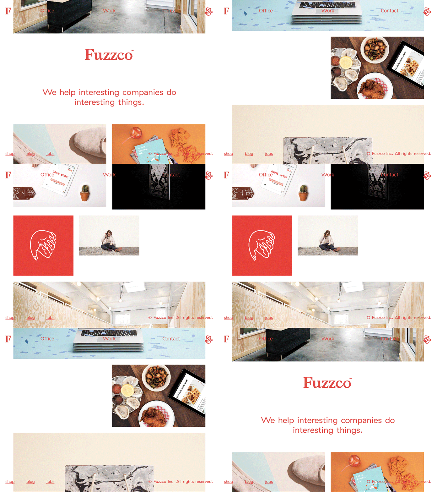
Fuzzco.com
I led the design on the Fuzzco website while I was there. It was a dynamic but simple studio website that lived on for 8 years (that’s an eternity in design studio website years).
Role: UI, UX, ConceptThe main eye-catching feature of the Fuzzco site is definitely the auto-scrolling home page. We wanted to grab attention and do something a bit crazy, but still present our work in a minimal and respectable way. What we came up with is a feed of images and text (customizable by anyone via the backend) that auto-scrolls. The page also has “no end” meaning when you reach one end, the other end appears. So a user can literally scroll forever. It’s fun.
Another noteworthy feature of this page is that when a user scrolls the page on their own, the auto-scroll will then begin scrolling in the direction the user began scrolling.
One huge feature we built on the site was a super easy and flexible system for adding case studies. Sites that have case studies often suffer from either doing them far too custom and as a result taking forever to publish new work, or looking too generic because it’s based on a generic template.
On Fuzzco.com we developed a super simple system for adding images, text, and links that makes it easy to upload images, position text wherever you want, and make every case study feel special. This same layout system powers the home page too, allowing anyone to update it and keep it fresh.
One last little feature that I love about this site is on the Office page. We did illustrations of the Fuzzco locations and then displayed the weather on top of the current time at that office. The thing I love about it is that the sun (or cloud, or moon) moves across the sky in the illustration according to the current time. It’s one of my favorite things I’ve ever done. I love tiny details like that that barely make a difference but just show an almost insane sense of refinement.
Previous project
Startups get Grover
Next project


