Drips
An app that allows users to stream money to anyone, with the underlying goal to make open source work sustainable. The visual identity and user experience were created to stand apart from typical crypto or finance apps, while still being super intuitive and easy to use.
Role: Visual Design, Branding, UX, UI, Design System
Illustration, Branding: Matt Massara
Other designers: Jason Efstathiou, Everett Williams
View it live: drips.networkWebsite
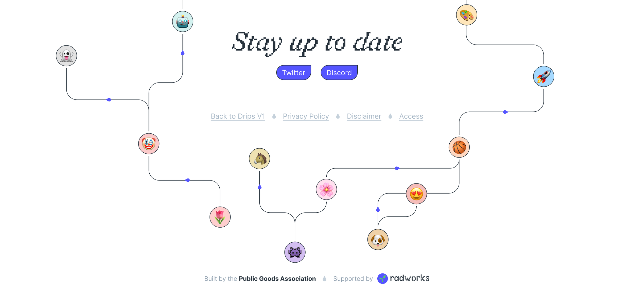
The landing page is decorated with an animated interpretation of the Drips funding network. It highlights the amount of money flowing on the platform right at the top.
I worked with Jason on an SVG animation illustrating the flow of money between users and projects for the hero on the homepage.
How to claim a GitHub project.
Users are able to claim their GitHub projects easily by just entering the GitHub URL which sends them directly into a claim flow in the app.
Based on existing lists that circulate in developer communities, Drips introduced the idea of funding lists, or Drip Lists. They’re easy collaborative ways to fund lists of projects and developers in the open source community.
How Drip Lists work.
Funds stream by the second.
One of the major innovations of Drips is the idea of streaming money. Any money streamed on Drips is streamed in real time.
And of course, the Drips network funding illustration continues to the end of the footer.
The website footer.
App
It’s not common for a brand and the UI of the corresponding app to be so tightly unified in style. Often you see exciting brands pushing the boundaries of design, but promoting boring looking apps. I don’t believe in that, so the app also uses the controversial brand font, and black outlines for UI elements.
The theming we implemented in the app makes it possible to choose a normie theme though, which will make the app look like every other app.
The explore page. See it live
The app first greets you with an explore page. This is a page with live data about money flowing on Drips, latest projects claimed, blog posts, and featured Drip Lists and projects we want to highlight.
Comprehensive search across the app.
We built a comprehensive search feature that searched all claimed repos and Drip Lists. Basically anything in the Drips ecosystem is searchable.
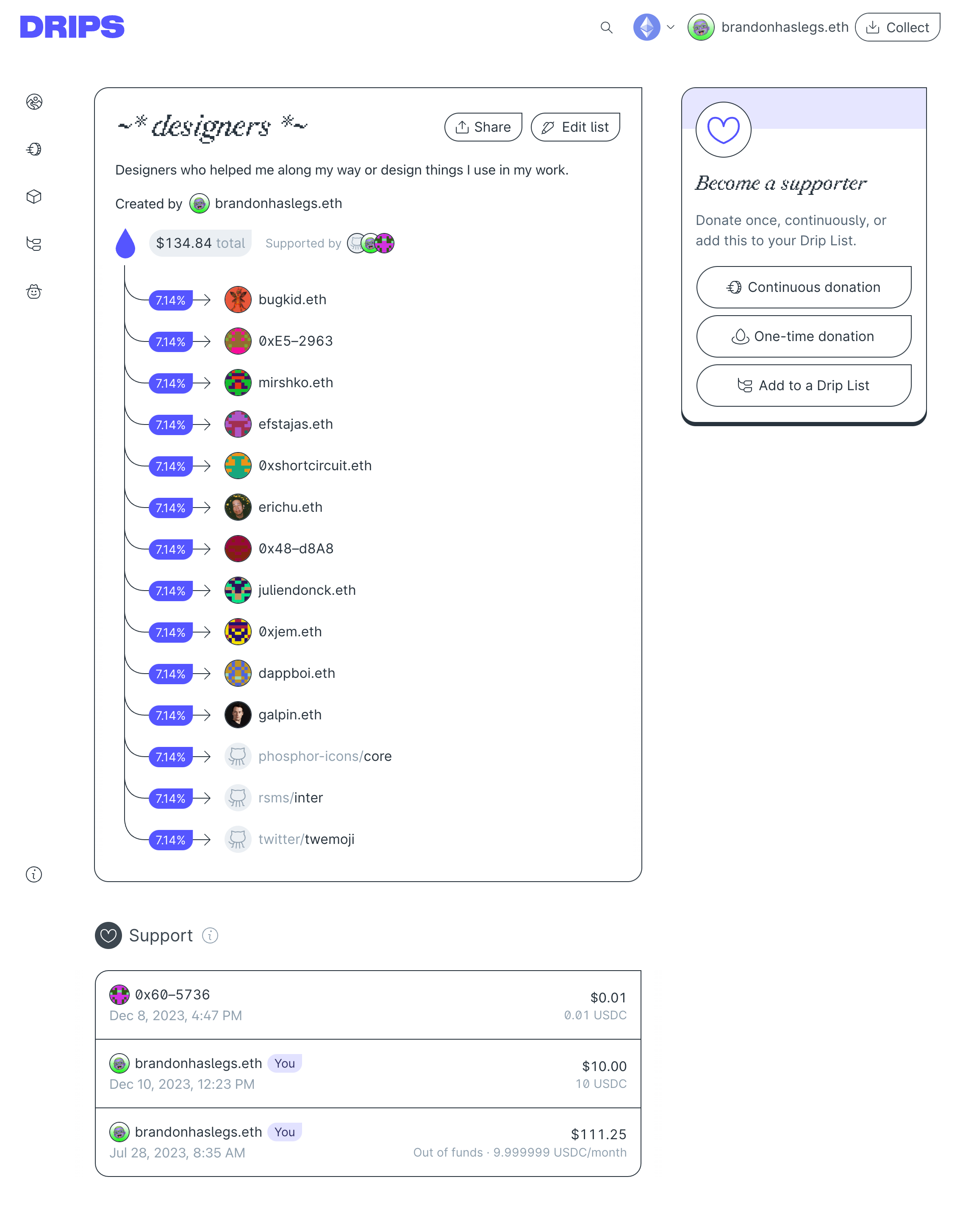
My Drip List I created to fund design stuff that I like. See it live
Here’s an example of a Drip List I created. Drip Lists can be fundable lists of anything with an ETH address or a GitHub repo. You can also nest Drip Lists in other Drip Lists. Composability! Imagine the possibilities!
Drip Lists have been used by multiple organizations to distribute millions of funds to all kinds of projects.
A claimed project with a customized green project color. See it live
What I love about the app is that it unapologetically has a design point of view, but doesn’t sacrifice usability along the way. In user interviews, people always say the app feels really good and is very easy to use.
A profile with various support streams and projects. See it live
Various modals from the app.
Also OBVIOUSLY the whole website and app is fully responsive and the theming doesn’t only apply to the app, it updates the landing page too. 😏
Illustrations
A range of illustrations were made from larger spot illustrations below, to other more utilitarian things like customized emojis and a full icon set.
Often emojis are the easiest way to put a quick illustration into a design, like in the header of a modal. I decided to take the Twemoji emojis and customize them to fit our design system. I think it works, and it’s an efficient way to make new small illustrations.
I drew a full icon set for the app which includes a lot of custom icons in specific funding and coding themes.
Conference Materials
Drips sponsored and is active at many Web3 conferences, so there was always something new to produce for a conference. Fun!
Various stickers and prints at a booth at EthCC Paris.
I had posters RISO printed with the Drips manifesto on them.
Me at a conference.
These were used to decorate our table but also could be taken as a kind of art print.
The table was very simple.
Dependency t-shirt.
You know that famous XKCD comic about how all modern infrastructure is based on that one project maintained by some guy in Nebraska? I made a t-shirt based on that.
I also worked on some slides for our founder’s presentation at the conference.
Conference slides.
I took a bunch of charts and graphs about funding open source and made swag for a conference in Taipei.
Shirt, shorts, hat, and transparent swag for a conference in Taipei.
For a conference in Berlin, I designed a Drips Guide to Berlin. It was cooooool. It’s graffiti themed, so it looks like Berlin, get it?
Your’e first presented with a map of Berlin with all the locations listed below marked on a Google Map.
It was so fun to do a bunch of graffiti for this!
Each of the suggestion cards was clickable and linked to the Google Maps page.
Graffiti type treatments.
Graffiti icon set.
I also designed a bunch of Drips posters in various styles to hang around the booth. This was an affordable and easy to execute way to make our booth look cool. I wasn’t there for the conference so it was also a easy way to design a booth that didn’t require precise planning. Anyone can hang some posters!
I made some great t-shirts because boy do I hate just slapping the logo on a t-shirt.
I also designed some temporary tattoos.
Previous project
✷ fun—ding
Next project


